
Local Business | Fitness & Wellness | Accessibility | Revenue Optimization
Mobile-First Redesign & Digital Strategy
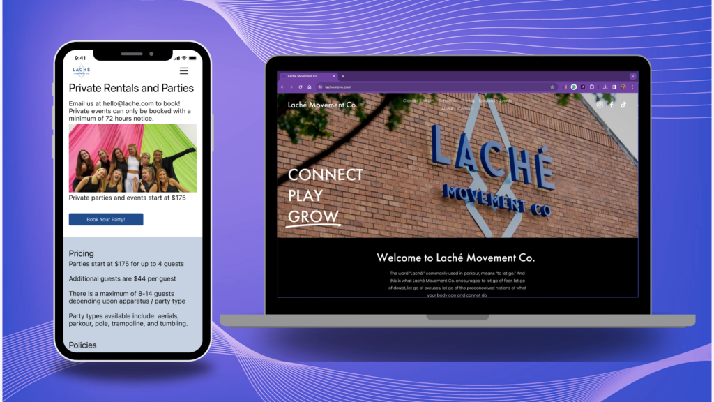
Laché Movement Collective is a boutique fitness studio offering an unusually wide range of movement disciplines — aerial arts, pole, parkour, acroyoga, and more. This variety is a core competitive differentiator, but it creates a significant digital challenge: the existing website had no clear hierarchy between revenue streams, inconsistent user flows, and multiple accessibility failures that were causing measurable drop-off at key conversion points.
Project Overview
Industry
Boutique Studio
Fitness
Local Business
Engagement
March – May 2023
Team Size
6 Stakeholders across Finance, Operations, Marketing, and Design
Methodology
Agile Sprints
Double Diamond Framework
Key Outcomes
16%
Total revenue increase since launching the redesigned mobile-first website
8%
Boost in product awareness from adherence to W3CAG visual accessibility standards
≥15-20%
Increase in usability for neurodivergent clients via cognitively accessible UX such as information architecture
100%
Success rate of usability testers navigating the user flow for private events
5
Distinct user flows embedded within a unified customer journey
13
Usability issues discovered via heuristic evaluation and resolved in redesign
Business Goals
Ultimately, the Head of Finance identified three revenue priorities that the digital experience was failing to support:
- Class bookings (memberships, packages, drop-ins) — the primary revenue driver — lacked clear CTA prominence
- Private events and parties — high-margin, high-potential — had no coherent user flow or sufficient information to convert interest into bookings
- Youth programs — an area of demand — were not differentiated in the IA, creating navigation confusion for parents
A heuristic audit prior to kickoff identified 13 discrete usability issues, including broken links, inaccessible color contrast, inconsistent CTA styling, poor error recovery, and slow mobile load times — all of which directly suppressed conversion and SEO performance.
Approach & Methodology
The project followed a Double Diamond framework across two parallel 3-week sprints — discovery/research followed by design/testing — with continuous stakeholder alignment throughout.
Discovery & Research
Initially, a heuristic evaluation was conducted to scope known issues before conducting primary research. Recruited 18 participants across user segments — members, class package holders, ClassPass users, staff, and co-owners — and facilitated a mix of 1:1 interviews and focus groups, including contextual sessions during the studio’s weekly open training night. Ran competitive analysis across 5+ regional competitors, benchmarking on SEO, load time, visual design, and event-page strategy. Supplemented with Google and Yelp metrics review and a survey of the existing brand’s market position.
Design & Testing
Synthesized research into affinity maps, 4 personas, and 5 user flows prioritized by revenue impact. Proposed and validated a revised information architecture through remote tree jack sorting sessions on Optimal Workshop, reducing top navigation from 9 to 6 links. Built mid-fidelity wireframes in Figma and conducted 2 rounds of usability testing with 9 participants. Iterated on visual hierarchy, navigation prominence, and hamburger menu iconography based on testing feedback. Delivered a complete style guide and accessible UI system aligned to the studio’s existing brand.
Role & Contributions
Working closely with the Head of Finance, Marketing Manager, and Studio Manager, I was the sole researcher and designer for the engagement.
| Function | Contribution |
| Heuristic Evaluation | Audited existing website using Nielsen’s 10 heuristics; identified 13 discrete usability failures spanning error recovery, IA, mobile responsiveness, and CTA inconsistency |
| Stakeholder Interviews | Facilitated 18 user sessions across members, staff, ClassPass users, and co-owners via 1:1 interviews and focus groups; synthesized findings into affinity maps |
| Competitive Analysis | Benchmarked 5+ competitors on SEO, load time, visual design, and private event page strategy; surfaced domain naming tactic that improved search ranking for high-value booking queries |
| Requirements Definition | Translated business goals (revenue prioritization, persona segmentation, youth IA isolation) and user needs into structured design requirements in collaboration with the Head of Finance and Marketing Manager |
| Information Architecture | Reduced top-level navigation from 9 to 6 links; validated revised IA through remote tree jack sorting sessions on Optimal Workshop; resolved broken links and menu discrepancies |
| Persona & User Flow Development | Developed 4 distinct personas; mapped 5 user flows with differentiated entry points and CTAs aligned to revenue priority tiers |
| Prototyping & Usability Testing | Built mid-fidelity Figma prototype; conducted 2 rounds of usability testing with 9 participants; iterated on visual hierarchy, negative space, and hamburger menu iconography based on findings |
| Accessibility Compliance | Redesigned UI to meet W3CAG color contrast standards; applied cognitive accessibility principles (multiple navigation pathways, simplified IA) to serve a disproportionately neurodiverse user base |
Research Insights That Drove Decisions
The revenue hierarchy had to be explicit in the IA
The Head of Finance was clear: classes are the primary revenue driver, private events are the growth lever, and everything else is secondary. Research confirmed that users encountered all of these equally on the homepage, with no hierarchy. The redesign restructured the hero CTA, navigation order, and page prominence to mirror this priority stack.
The target audience skews neurodiverse — the site needs to be built for them
A co-owner noted that Laché disproportionately attracts neurodivergent individuals. The existing site violated multiple cognitive accessibility standards: too many font styles, insufficient color contrast, inconsistent navigation patterns, and a mobile experience requiring excessive scrolling. These were not cosmetic issues — they were conversion barriers for a core segment of the user base.
Private event potential was entirely untapped digitally
Interviews revealed that many users were unaware of Laché’s private party and event offerings. Competitive analysis showed that rival studios were capturing bachelorette and private event search traffic through dedicated landing pages and secondary domain names. This gap represented a clear, actionable revenue opportunity that the redesign directly addressed.
Personal bias required active management
As an existing Laché customer and aerialist, I assumed that class cancellations were a major pain point and that series-format classes were preferred. Both were disproven by research data. This experience reinforced the importance of structured research methods over intuition and shaped how findings were presented to stakeholders throughout the project.
Skills Demonstrated
This project demonstrates a skill set relevant to UX, business analysis, product strategy, and operations roles:
- End-to-end research ownership: screener design, participant recruiting, moderation, synthesis, and stakeholder presentation
- Business requirements gathering: translating financial priorities and operational constraints into design specifications
- Information architecture validation using remote usability testing (Optimal Workshop tree jack sorting)
- Competitive and market analysis to identify positioning gaps and revenue opportunities
- Persona development and user flow mapping are tied directly to revenue tier prioritization
- Accessibility compliance (W3CAG) applied in practice across visual and cognitive dimensions
- Iterative prototyping with quantitative usability testing across two test rounds
- Cross-functional stakeholder communication across finance, operations, and marketing
Reflections & Learnings
This project sharpened two skills that are difficult to develop in larger, more resourced teams: working around stakeholder availability without losing momentum, and managing personal bias when you are also a user of the product you are designing.
At first, the team was small and stretched thin. Adapting the research plan in real time — shifting between 1:1 interviews and group sessions based on who was available, using competitor copy as placeholder content to keep prototyping moving — required the same kind of pragmatic problem-solving that characterizes strong BA and PM work.
On the second, pre-existing familiarity with the product created assumptions that had to be actively surfaced and tested against data. Two of those assumptions were proven wrong. Documenting that process transparently in stakeholder presentations built credibility with a team that initially needed convincing on the value of a research-led approach.