Solo Concept project📱 SAAS ApP PRODUCT DESIGN
Reflect Mobile App
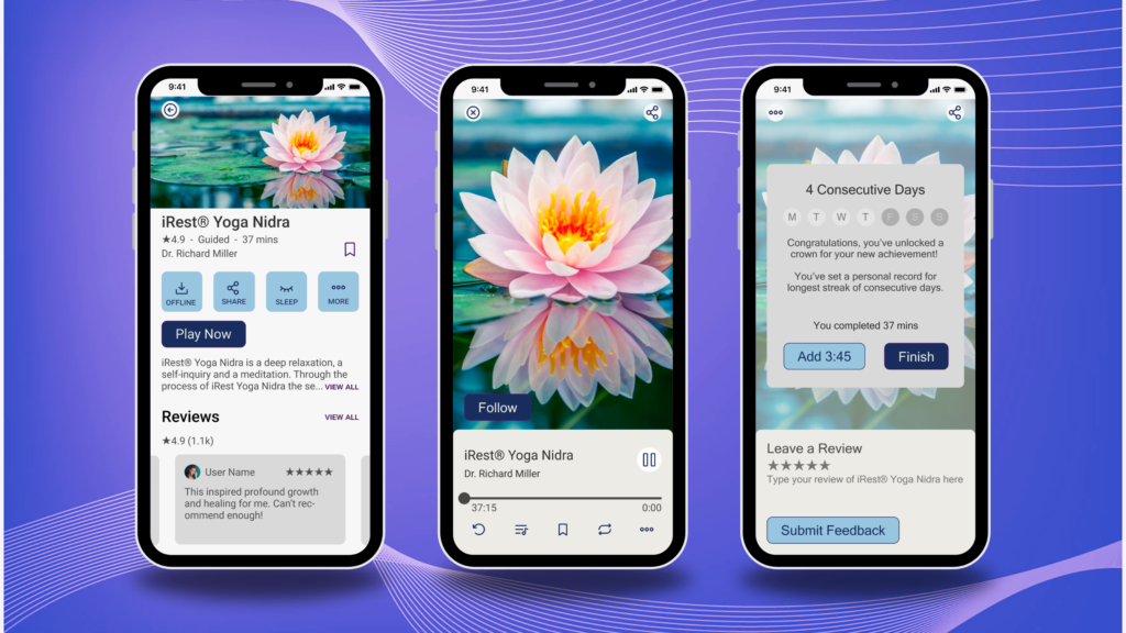
I created this mindful lifestyle app to cater to a full spectrum of user needs by drawing from accessibility standards for visual and cognitive diversity. My background in clinical research in yoga therapy set the stage for targeted approaches to brand design, content strategy, and gamification in this app product design. We set up meditators for success by incentivizing consistent usage!
Overview
My Role
- UX Researcher
- UX/UI Designer
- Brand Designer
- Product Strategist
- Product Manager
Timeline
- May 2023 – June 2023
- Total Time: ~100 Hours
- Overall: 5 Weeks
- Discovery & Research: 2 Weeks
- Design & Testing: 3 Weeks
Data-Driven App Product Design with Impact
15-20%
Increase in neurodivergent usability via cognitively accessible UX considerations
≥ 8%
Boost in product awareness from adherence to W3CAG visual accessibility standards
3
Scientifically informed gamification features support user retention and the neuroscience of habit-building
100%
Success rate of usability testers navigating the user flow for finding and completing a meditation. It meets the requirements for a MVP!
User Goals
Users want to be a better version of themselves.
- Listen to heart and intuition
- Set intentions for day/week/life
It’s important to them to be met where they’re at…
- Simple practices that start with the basics and remove needless complexity
- Gain access to concentrated resources that support existing practices
They need reminders to create time to slow down and reflect.
- Feel more calm, present, and grounded
- Support mental health and alleviate symptoms
- Increase focus, cognitive functioning, and productivity
Problem
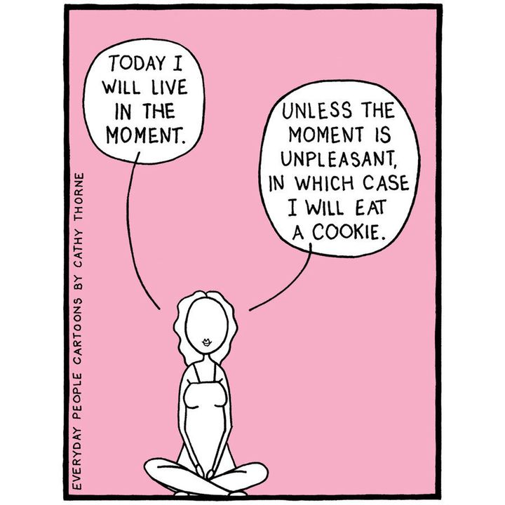
Meditators often have self-limiting beliefs, especially at the beginning of their journey.
- There’s a misconception that only long, quiet, still meditation “counts,” but unfortunately that’s often physically, mentally, and environmentally inaccessible.
- People know they need intentional downtime to thrive, however they are “too busy” surviving.
- Psychosomatic discomfort can bring up unsettling thoughts and feelings that are hard to be present for, thus often leading people to turn toward “easier” coping mechanisms.
- Users have polarized credos so the product needs content tailoring and intentional delivery.
Solution
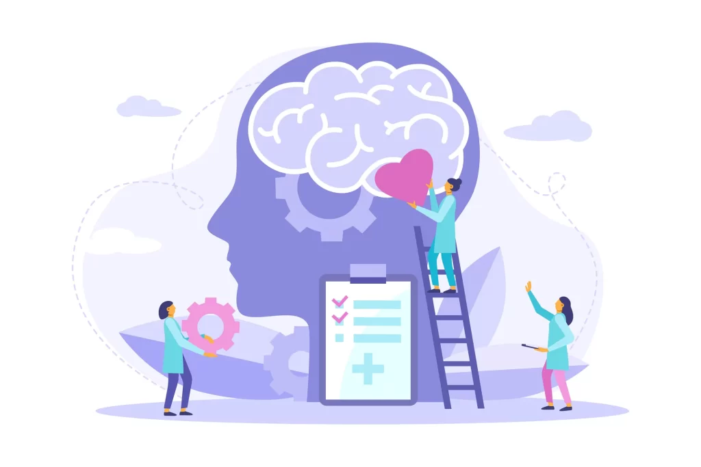
Thus, the following innovative feature solutions support neurodiversity better than existing functional frameworks within the market.
- A front-end survey differentiates users based on beliefs, experience, and best practices or contraindications to mental health predispositions.
- Personalized experiences provide the agency in relaxation that can therapeutically support various learning styles or cognitions.
- Biochemistry favors positive reinforcement from reminders that reinforce meditation benefits through a reward system via gamification of streaks and milestones.
- UI must respect the sanctity of time
- Easily accessible pre-set timer feature
- Consistent reminders at customizable times
- Content filters by time, favorites, and recently played
- Cognitive accessibility
- Expandable/collapsable content that streamlines UX
Design Process
Double Diamond Framework
Using research discovery and exploration to refine user problem identification. Then, data analytics inform design prototypes that undergo further testing to ensure the solution supports the user experience. Ultimately, the result is a user-friendly app product design.
UX Research
Research Objectives
Initially going into the project with a connection to the industry and a preferred meditation app, I first acknowledged my personal biases and assumptions. I needed to set them aside to…
- Understand the meditator’s desires, desires, and pain points while establishing a habit
- Uncover usage patterns and feature desirability
- Articulate what helps meditators’ long-term success with consistent user retention
Competitive Analysis
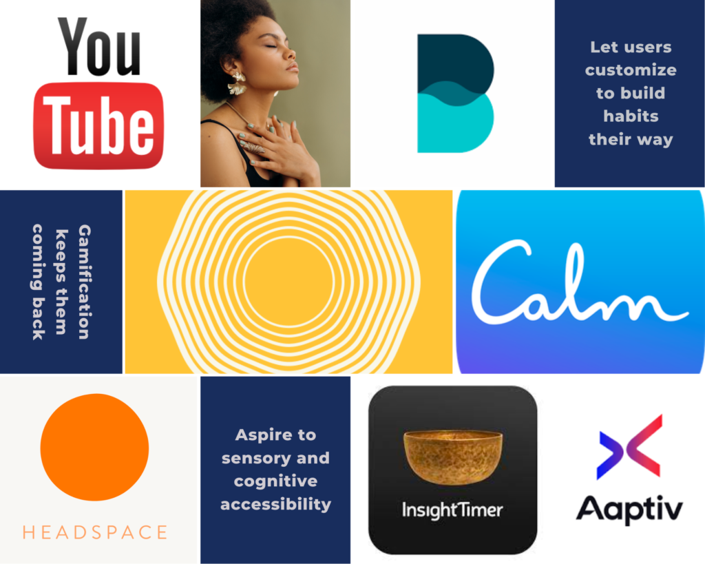
Ultimately, this research informed the design process by emulating what’s working and pivoting to do better where user struggles or market shortcomings exist. Identifying the pros and cons of the three leading competitors apps (Insight Timer, Calm, and Headspace) through
- Contextual analysis of app store reviews
- Competitive analysis with free trials
- User interviews with qualitative insights
Data was collected to account for
- UI/UX patterns that support habit-building and engagement
- Various types of content (auditory, visual, kinesthetic) for different learning styles
Interviews
To protect user privacy and get an authentic answer, interviews were the chosen research methodology. Recruiting eight meditation app users who have various mental health conditions (including ADHD, OCD, PTSD, dyslexia, clinical depression, generalized anxiety disorder, etc.) yielded qualitative data from the target audience. Using peer-reviewed interview questions to refine awareness of
- User’s lifestyle practices (existing habits, coping mechanisms, and resources)
- User desires, needs, and pain points
- User impressions of competitor apps
Insights from these interviews were then transcribed onto the Miro affinity map.
UX Research Takeaways

Selecting an App / Product
First impressions matter and friends talk.
- Most users find a meditation app through word-of-mouth recommendations.
- Additional content on other platforms boosts brand awareness.

Consciousness Matters
Some competitor apps fall short by pigeonholing users. Reflect can do better!
- Sensory perception impacts learning styles, engagement, and thus how users relate to content.
- Psychosomatic healing contributes to mental health and resources for all layers of being are appreciated.

User Support
Customizability is key and differentiates this app product design.
- Biochemistry favors positive reinforcement from reminders, gamification of streaks, and milestones.
- Front-end survey helps meet users where they’re at based on goals, experiences, and beliefs.
UX Ideation
Personas
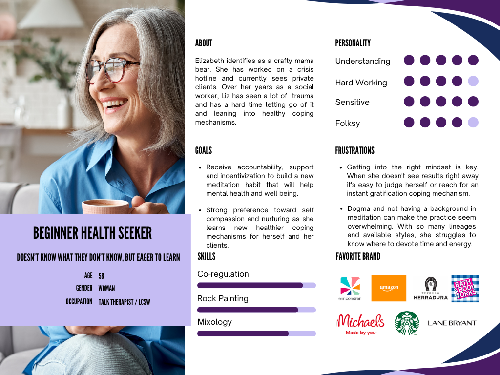
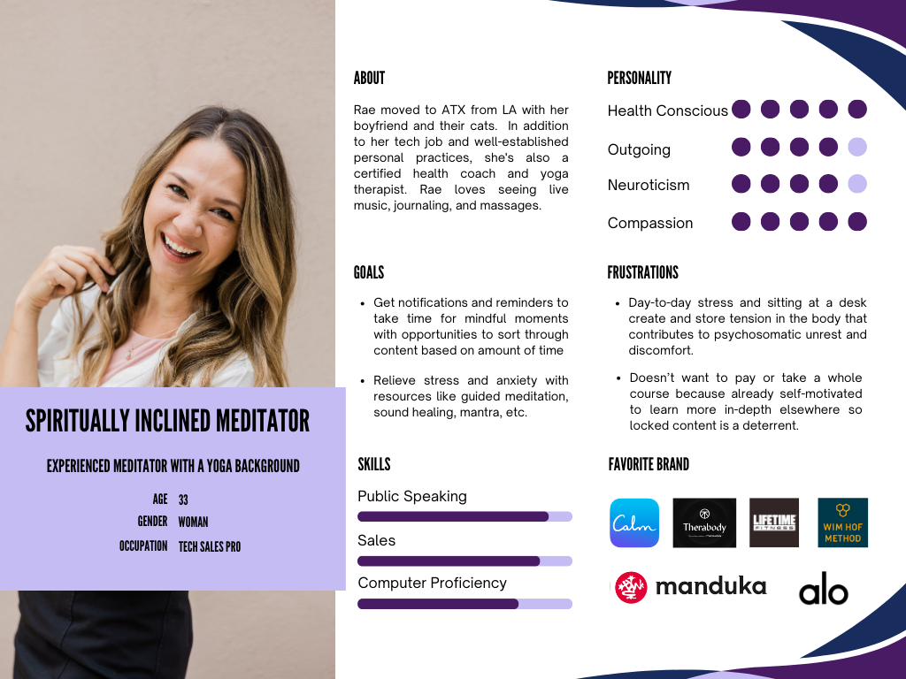
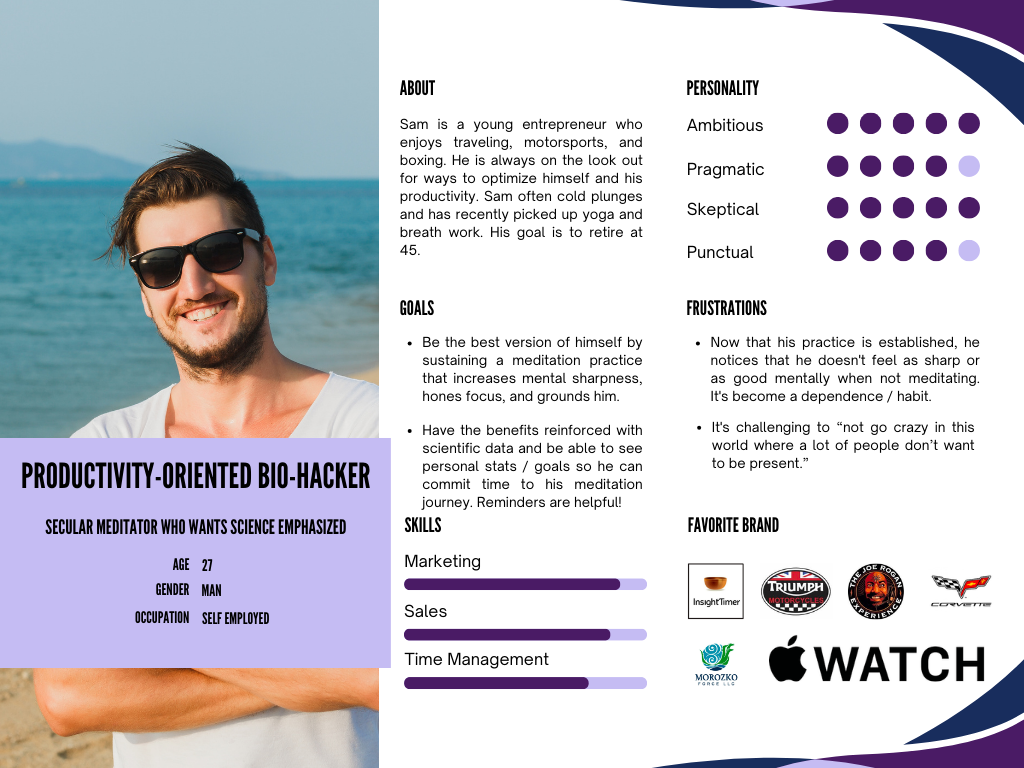
Needing to structure the insights about user behaviors, goals, needs, and pain points gathered in interviews prompted me to create three personas:
- Beginner health seeker
- Spiritually inclined meditator
- Productivity-oriented bio-hacker
These personas consider experience level, personal belief, and individual preference so that the platform can meet them accordingly. By evaluating forks in the customer journey to funnel different personas into customized experiences, the brainstorming process for questions relevant to the entry survey took form.
Creating Moments that Matter In App
Since the beginner journey often has little guidance to best practices, it’s ideal to fine-tune recommendations with a thorough intro survey that gathers data for an algorithm that matches users to clinically proven content with evidence-based studies. The option to skip, start, and save sections, or complete them later with reminders is provided. Survey sections include:
- Time
- Mental Health
- Psychosomatics
- Spirituality v. Science
- Privacy
User Flow
Users need to easily complete a meditation with “as few clicks as possible” so a flow consisting of just three clicks was created for testing.
Cognitive accessibility standards require users to have multiple pathways, and thus compelling search and save features of the sticky bottom navigation bar were created. The UI at the top of the home page includes customizable navigation buttons (adaptable through profile settings) that honor desirability data by including a timer, a recently played section, and content targeted to goals. Content in the carousels can be curated based on:
- Personalized info from the entry survey
- An algorithm that tracks user history and common trends
- The broader strokes of well-ranking reviews
Sketches
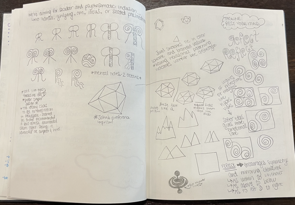
Starting with lo-fi branding and wireframe sketches enabled gathering feedback to inspire better digital versions. After multiple versions of the screens, content cards, and toolbars it was determined:
- Most people liked the prism logo, but gamers immediately saw a dodecahedron dice, so an oblong shape was re-iterated to remove the unrelated connotation
- Bookmark icons are preferable to heart icons
- A screen with more details about the content that precedes the play screen is desirable
UX/UI Design
Usability Testing
Overall, usability testers had a 100% success rate navigating the user flow of finding and enjoying a meditation. Testing was conducted in person to gain further contextual analysis. Feedback quickly exhibited trends about what was or wasn’t intuitive and valuable or not that would go on to inform re-iterations. As the meditation cards came to life with content, notes on insights unveiled during usability testing allowed for more improvements to font, sizes, and colors.
Usability Testing Takeaways

Saved v. Playlists
- A usability tester with OCD wants options for saved folder organization like Pinterest or Instagram.
- Playlists make sense for Kirtan practitioners who want more than one recording at a time without the conclusion screen.
- However, playlists complicate users’ review options if they listen to multiple things and content blurs together.

Privacy
- The share feature wasn’t widely appreciated. Users shared compelling reasons to default to privacy.
- Most usability testers were confused by the “Private” button for streaming without visibility to followers.
- If this feature is kept, then privacy settings must be part of the front-end survey setup.

Orienting Pop-Up Boxes
- Saving content is denoted with the filled bookmark icon congruent with the saved section.
- The quick navigation buttons on the home screen and how to customize them.
- The optional sleep feature can complete and log the meditation once finished, but some thought it was a do-not-disturb feature linked to sleep aid content.
UI & Brand Design
Since visual clutter creates mental clutter, the style was light, simple, and clean. Using expandable/collapsible content display options and the dyslexia-friendly sans-serif font Roboto, the presentation of info is clear.
By avoiding bright colors in favor of pastels and deeper tones, I was able to…
- Achieve ideal color contrast ratios for better visual accessibility
- Reinforce the brand values with a calm, cool, and collected color palette
- Use color psychology to bridge the gap between various persona motivations
Cognitive accessibility is a key factor in a resource that may be used for mental health. Thus, UI was structured using World Wide Web Consortium (W3C) Web Accessibility Initiative (WAI) guidelines for adaptable, distinguishable, and predictable navigation. Due to time constraints, I exclusively designed with iOS Style guide features in mind.
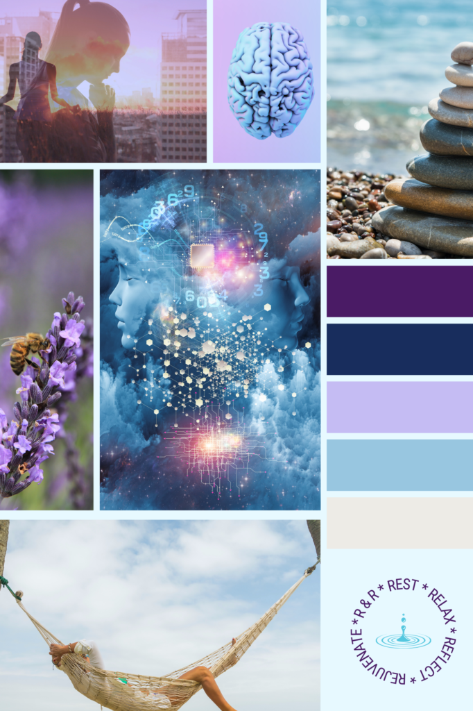
Blues and purples support both spiritually conscious and purpose-driven objectives for personal productivity. Intentional branding inspires trust and confidence.
Hi-Fi Wireframes
Usability testing began with mid-fidelity with a Figma prototype that evolved to hi-fidelity through three iterations. Key insights about users’ expectations for function and UI such as button placement or typeface supported pivotal changes. The app product design continued to evolve.

Conclusion
Next steps
Due to time constraints for this mobile app product design, I only able to flesh out a mostly functional prototype for all user flows on this mobile app. However, the final page of the affinity map showed the potential avenues for business growth.

Get Users Engaged
More community-building features
- Most helpful for those without an “in-person” support network
- “People who are on the same path with similar struggles that can offer tips and advice are nice” but this is a mid-range priority
- Community is best when it’s visible, optional, and easy to engage with via like, wave, etc.

Provide Additional Resources
Content to extend brand awareness
- Establish Reflect as an authority in (yoga) therapy and meditation for mental health
- Share insights about resources on mindfulness bio-psycho-social studies
- Other brands are doing…
- Netflix series
- Spotify podcasts
- Youtube seminars

Market Tastefully
Monetize special content with a subscription-based service
- Fundamental features and content should be accessible with “freemium”
- New users deserve a free trial to eliminate barriers to them getting started
- Consider that the “commercialization of spiritual goods doesn’t feel good.”
Learnings
During this project, I read a lot about cognitive accessibility guidelines and considerations for better neurodiverse user experiences. This growth as a designer allows me to serve the ever-growing population of humans being diagnosed.
I had beliefs about users wanting to share that were crushed by usability testing. Instead, I discovered with the importance of user freedom, choice, and privacy.
Thanks for reading my case study!
Think we’d be a good fit for collaboration? I’d love to hear from you.
