Cross-collaborative agile UX/UI Design
Supporting Indie Film Fundraising
To re-align the digital footprint with user experience considerations, we used responsive web design, SEO-oriented social media marketing rollout, and brand re-alignment toward accessibility standards. Elevated indie film fundraising, 2 formal letters of interest from different arms of PBS, a clear understanding of our target audience, and corporate sponsorships ensued. Check out Touching the Sky Film: The Acro Documentary, releasing in 2026!
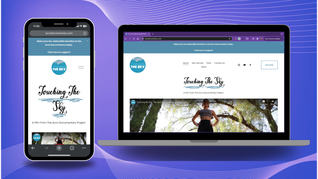
Overview of Indie Film Fundraising
My Role / Impact
- UX Researcher
- UX Designer
- Brand Strategist
- UX Copy Writer
- Grant Writer
- Content Creator
- SEO Analyst
Team
- Producers: Tim Hedberg & Chris Jeckel Marx
- Project Manager: Hayley Clemmens
- Social Media Manager: Paola Beatriz Rodríguez Borrés
- Marketing Manager: Andrea Stefanía Rojas Niño
- Creative Producer: Sam Tilford
- Graphic Designer: Valería Lujan
Timeline
- Overall: December 2023-Present
- Total Time: ~300 Hours
- Sprint 1: Establish Digital Footprint
- Sprint 2:
- Sprint 3: Grants and Corporate Sponsorships
- Discovery & Research: 5 Weeks- 3 for Qualitative; 2 for quantitative
- Design & Testing: 6 weeks
Tools
- Figma
- Square Space
- Meta (Facebook, Instagram, WhatsApp)
- Miro
- Trello
- Asana
- Canva
- Google Suite
- iOS & Android
- Grant Advance
- Rocket Reach
Impacts on Indie Film Fundraising
5%
Increase in total revenue since launching the re-designed mobile-friendly website
8%
Boost in product awareness from adherence to W3CAG visual accessibility standards
≥15-20%
Increase in usability for neurodivergent clients via cognitively accessible UI/UX
100%
Success rate of usability testers navigating user flows for donations
2
Formal Letters of Interest from different arms within PBS
1
Seamless Digital Experience
Business Goals
🎥 The Acro Documentary Project wants donations, grants, and corporate sponsorships to support indie film production. They plan to release and go to film festivals in 2026! 💰
How?
Develop a cohesive brand identity through an expanded digital footprint to increase product awareness and user engagement.
Gather user support via donations, volunteer work, and word-of-mouth marketing to continue with indie filmmaking production.
User Goals
📺 Users are eager to watch the storylines chronicling acro lifestyles because they combine healthy practices that transcend age, race, ability, and any other box. 🤸🏽♀️
Why?
To experience Touching the Sky Film and the ripples it sends into the global acro scene, including an increase in public health, the overall number of practitioners, and increased diversity within the discipline through representation.
Many feel invested in the project’s success because of personal ties to our team and mission.
Problem
📱 How can we unify the digital footprint to inspire confidence in the authenticity of the cause that supports donations? 💸
🚀 How can we connect with charitable foundations for grants and high-profile businesses for corporate sponsorships?
Questions and Considerations
How can we increase donations?
What can we do to build product awareness?
How can we help people understand indie filmmaking requires sponsorship?
May we also consider user flows for people who find the website through our fundraising events?
How can we target TTS documentary supporters who are currently uninvolved in the acro community?
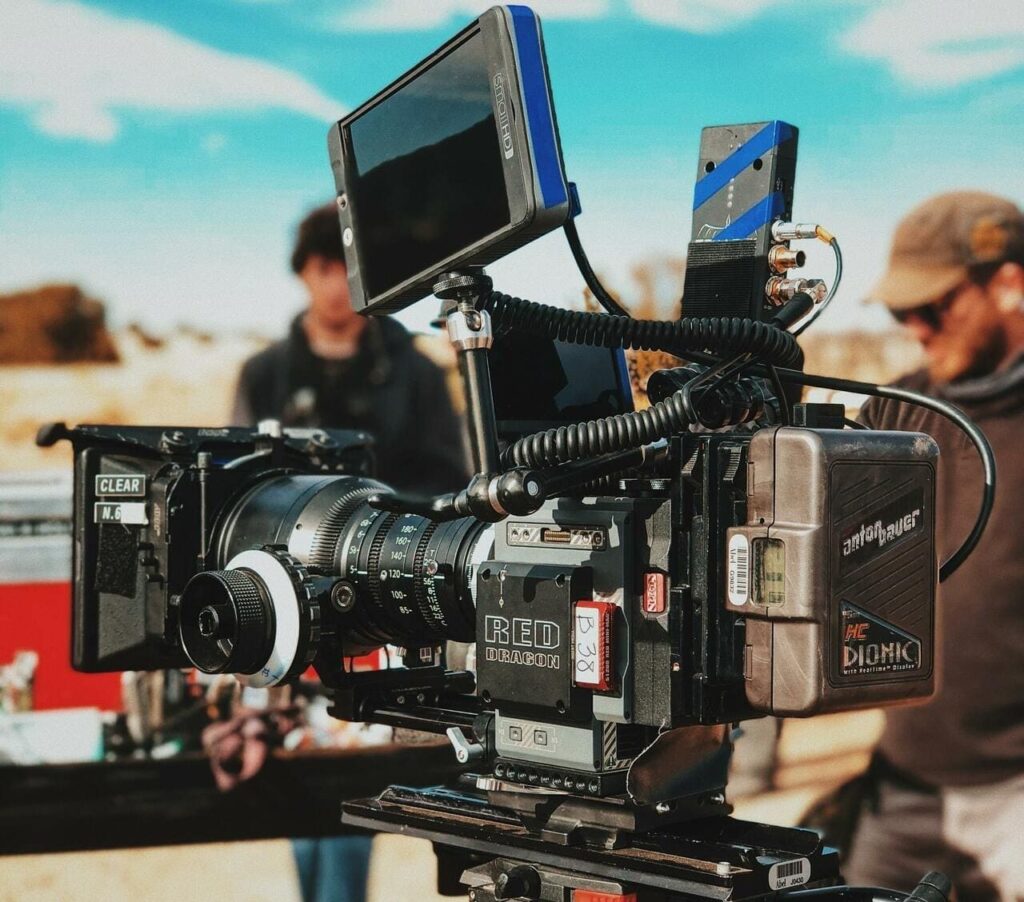

Solution
We can edit our presentation using data-driven content, brand, and social media marketing strategy to identify and be more relatable for all personas in our target audience.
How?
Streamline the user flow entry points while rounding out the overall customer journey and boosting SEO.
Accessibility forward re-brand and launch an expansion of digital footprint through website re-design, Meta, YouTube, and mailing lists to direct users to the website.
Fundraising campaigns or sprints with specific goals, outlines of expenses, and targeted outreach. We’ll use gamification and corporate matching as much as possible.
The Product
Design Process for Indie Film Fundraising
Double Diamond Framework
In each sprint, I develop prototypes that undergo further testing to ensure the solution supports the user experience. Design thinking draws influence from cross-team collaboration in an agile UX workflow environment.
1st Sprint
Qualitative data was gathered via interviews with concept testing to refine the visual brand identity with alignment toward accessibility standards. Then, the digital presence was overhauled with a new brand style guide, refreshed copy, and streamlined user flows.
2nd Sprint
We gathered quantitative data through surveys and data analytics to ensure that we reached our target audience with the intentional allocation of our marketing budget.
UX Research
Research Objectives
Since the goal is to attract supporters of our story, it was important to go into discovery and emerge with an understanding of these concepts better. We used these insights to adapt our digital content, brand, and marketing strategy. ♟️
Considerations
Understand how we attract our target audience.
Clarify why we draw in our target audience.
Understand how we can utilize KPI (engagement, advertising, etc.) to garner their support via donations and volunteering.
How are people engaging with it?
Why are people engaging with it?
Is engagement sustained? Why or why not?
Be mindful of assumptions: Short-term engagement that results in donations leads us to our goal faster than sustained engagement without financial commitment.
Who is donating and why?
Is there a benefit to reaching out to non-donors?
Understand how to re-brand in alignment with target audiences (including visual and cognitive accessibility standards).
Heuristic Evaluation
When the Acro Documentary team brought me on to help, they had already built an existing website and Instagram. Thus, conducting a heuristic evaluation of the website became an initial order of business.
This process uncovered key changes for re-design:
Make the navigation bar sticky to resolve usability shortcomings.
Edit UX copywriting to correct errors, contextualize indie filmmaking, and organize info architecture into clear user flows unified throughout the customer journey. Consider adding a Privacy Policy and Contact page.
Resolve visual hierarchy/prominence issues with better consideration for screen reader users.
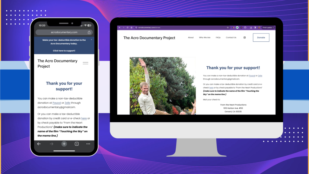
👀 Beyond the visual hierarchy issues, a key error in the body copy could severely stifle users from donating to the Acro Doc Project. Do you see it? Hint: ssǝɹpp∀ lᴉɐɯƎ ǝɥʇ ʞɔǝɥƆ
Interviews
Initially, research objectives and interview questions were developed to clarify our target audience’s values, motivations, and pain points to create personas. Findings from user interviews are accounted for in affinity maps to ensure the customer journey supports people with or without a background in acro yoga or indie filmmaking.
How?
With help from the team, prior donors were recruited, and I interviewed them remotely. Participants who have yet to donate to the Acro Documentary Project were recruited and interviewed remotely to get prospective supporter feedback.
Half of the UX interview participants are actively involved in the acro yoga community, while the other half do not but admire the practice. For best results, diverse participants vary in age, gender, ethnicity, country of residence, etc.
Brand Concept Testing
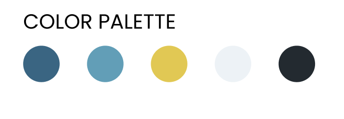
🧑🦯 Chris Jeckel is one of four voices telling the story in Touching the Sky. He is a blind acrobat, lawyer, film producer, and champion of DEI initiatives. Producers agree that it’s essential for the details in the color palette, typography, and voice to reflect our brand values. While the initial color scheme was light and gave partly cloudy/blue sky vibes that felt like Touching the Sky, it posed a challenge for color contrast ratios. 🌤️
How?
White text on a light blue background doesn’t pass W3CAG color contrast ratios for visual accessibility.
Digital designs use too many fonts, violating cognitive accessibility standards. Some fonts are distinctly full of character but hard to read.
SEO is split between the two brand names: Touching the Sky and Acro Documentary Project. To prevent our brand identity from being watered down, we can consolidate our brand identity by using Touching the Sky Film: The Acro Documentary.
Quantitative Data
The team felt that our target audience is primarily young women with ties to the health and wellness industry. Initially, we imagined that many are climbers, dancers, or have other tangental hobbies. To find out for sure, we conducted market research through Survey Monkey and analyzed metrics from Facebook ads.
Demographics Tracked
Gender
Age
Activities
Profession
Touching the Sky Film Impressions
UX Research Take-Aways

Re-Branding Concept Test Results
- Touching the Sky Film: The Acro Documentary is inviting to both personas and supports SEO.
- Our brand values resonate deeply with our base. Let them shine.
- Consolidating to a single sans-serif font is simple, and places focus on our message.
- Users agree that more excellent color contrast ratios make for easier readability.
Word-Of-Mouth Marketing Works
- Our audience mostly sees updates via filmmakers’ social media posts, but some benefit from email newsletters.
- Advocates or foot soldiers known as “Friends of the Doc” can have a powerful impact in disseminating the message. We need to tag, activate, and include.
- Making a Facebook business page for SEO and sharing its posts with personal accounts is ideal for visibility.
Indie Film Fundraising Techniques
- Feeling passionate or connected to a cause can prompt more donations.
- Details are key. Users want to know exactly where their money is going.
- Importantly, gamification is a great motivator. Fundraising goal sprints get users to give.
- Corporate matching is compelling.
- Repeat donations are sustainable and ideal.
UX Ideation
Personas
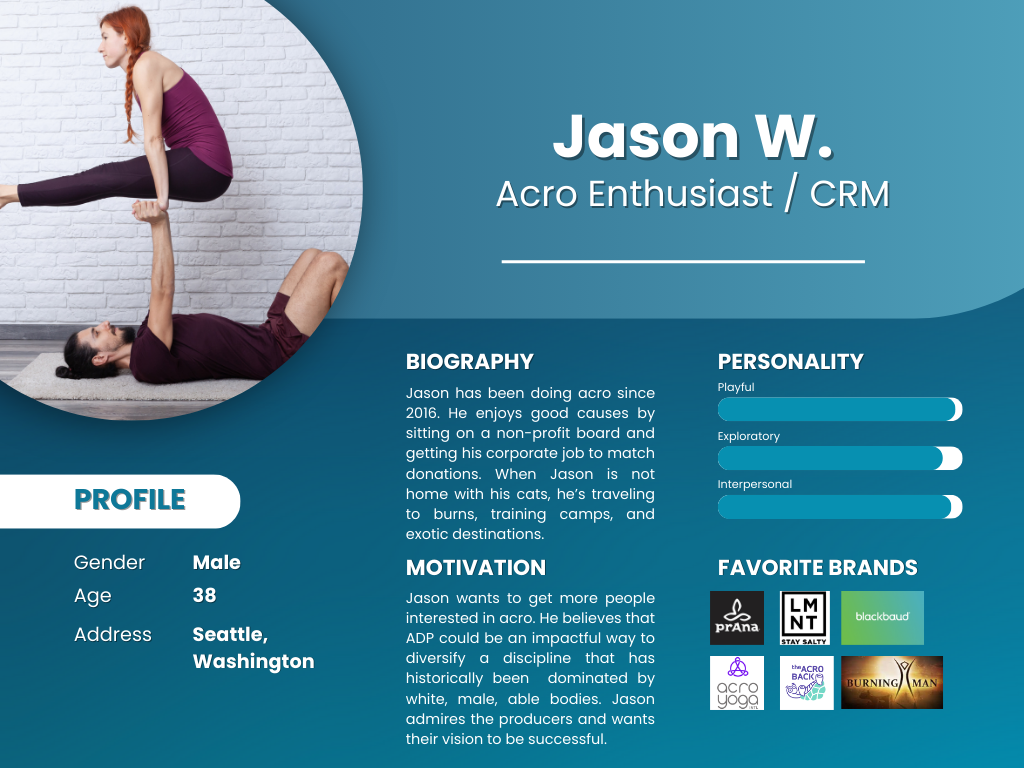
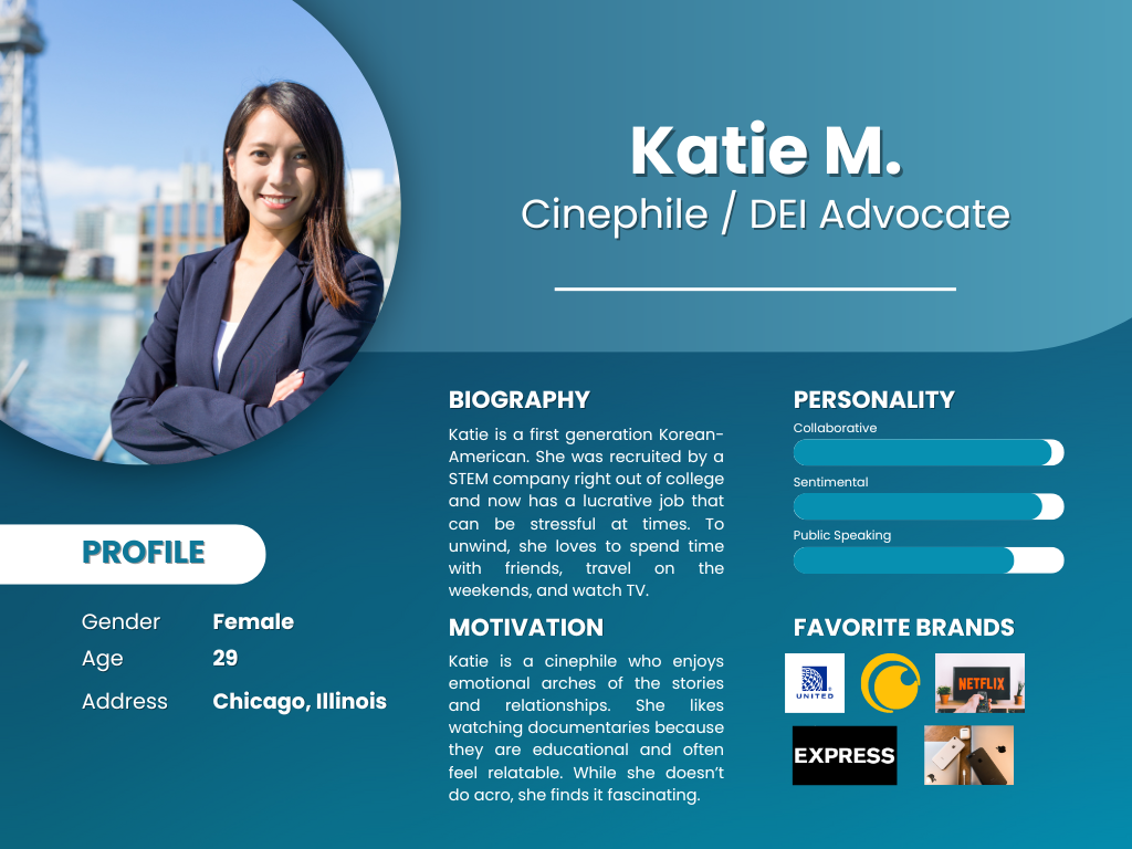
Before affinity mapping, the preliminary personas envisioned were acro enthusiasts and non-acro practitioners who appreciate the storylines or educational components. Another noteworthy split in our target audience is cinephiles (perhaps some with industry knowledge) and more casual viewers who may not know the ins and outs of film production. Research affirmed this and deepened our understanding of what motivates each individual to contribute to our cause.
How?
Discussing acro yoga without too much jargon is crucial to align both personas. We need to use terms that translate to transcend the physical practice and point to the metaphysical elements that all humans can understand, such as trust, communication, and collaboration.
It was a pleasant surprise to hear that most of our user research participants hadn’t encountered many pain points while interacting with our brand. However, the primary concerns center around closed-off social media engagement that doesn’t welcome collaboration, rag-tag fundraising events, and potential donors not knowing where their money is going.
UX/UI Design
User Flow
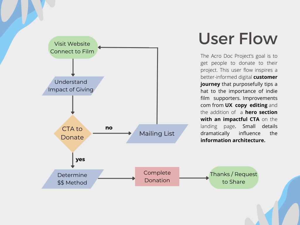
When considering the user flow, it is essential to remember the importance of a sales funnel that directs users toward charitable donations to indie film fundraising. However, the conundrum uncovered in UX research underscores users’ lack of interest in being sold/advertised without proper rapport and connection building. The amount of “skin in the game” each persona has varies depending on their knowledge of the acro yoga community and independent film production. Thus, the information architecture, body copy, and content are reorganized and further fleshed out.
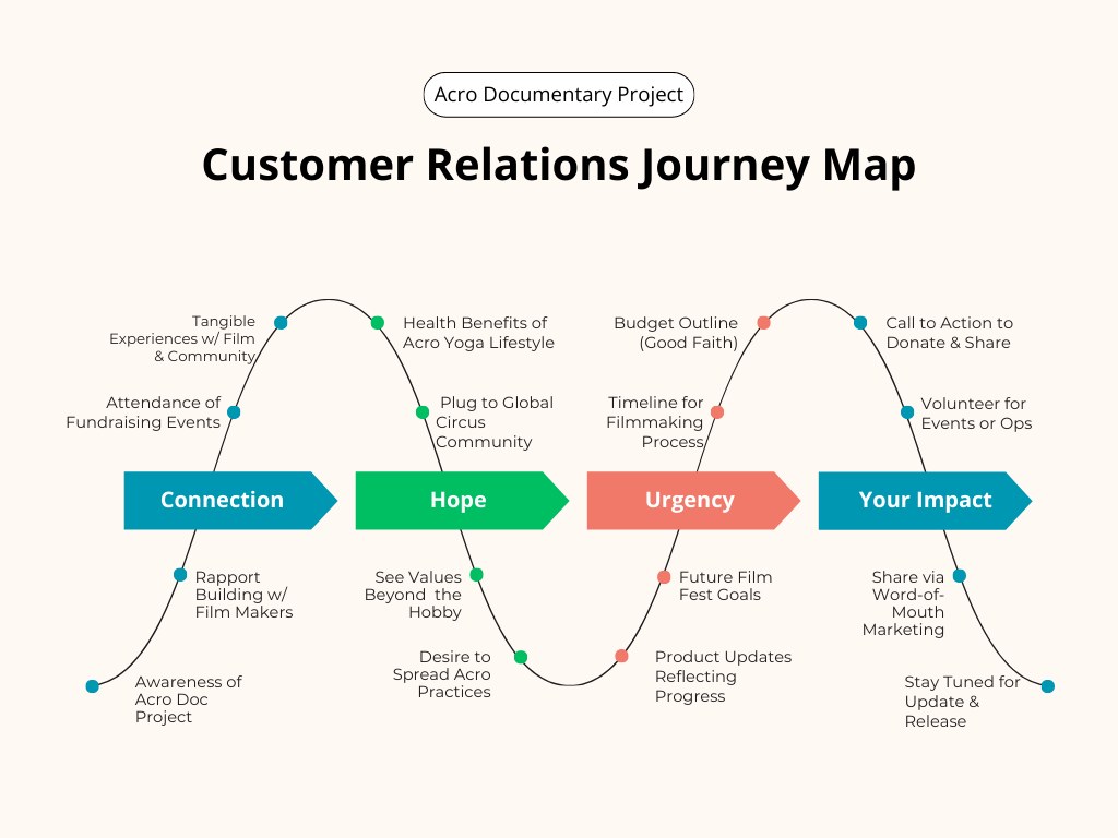
Customer Journey
Ultimately, the objective throughout the customer journey is to inform, instill confidence, and inspire action. We want our users to empathize with the struggles of independent film production and understand how important they are to the fundraising process so they are motivated to get involved.
UI & Brand Design
A new style guide was crafted and concept-tested to address the shortcomings of inaccessible UI and brand design.
Feedback from concept-testing
We limited ourselves to a single sans-serif font. Since Poppins was already in use on our website and aligned with our brand values, we kept it. This change beautifully supports cognitive diversity, which is often disproportionately represented within the circus community.
8% Increase in product visibility by adhering to color contrast ratios without diminishing the existing branding of being “up in the clouds.” This was challenging because the sky and clouds are both light hues, but we achieved greater readability by never placing images behind text again.
Usability Testing
Using Figma, a mid-fidelity wireframe prototype was constructed for usability testing. The user flow for donation collection was tested after recruiting usability testers who represent our target audience (by having a vested interest in healthy living). Usability testing yielded a 100% success rate and affirmed the UXR insights about the website’s efficacy. “But people aren’t going to find the website unless they find it through an avenue, which probably would be social media,” says a UXR participant with extensive experience in digital marketing and acro.
Conclusion
Next Steps for Indie Film Fundraising
The foundation is set now that we have clear personas, user flows, and a unified customer journey. However, since users in our target audience will need a means of connecting to our project via the website, our work in social media marketing is just beginning. We’ve created a Facebook and linked it to the existing Instagram. We’ve created an Official Touching the Sky Film YouTube Channel and embedded teaser clips/trailers within our website to support SEO, LinkedIn, and beyond. In essence, now we need eyes on it!

Sharing Content
- UXR suggests filmmakers and “friends of the doc” with close connections are highly effective foot soldiers for word-of-mouth marketing, especially since personal pages rank better in the algorithm than business pages.
- Future in-person fundraisers can be promoted via Facebook events.
Corporate Sponsorships
- Connecting with businesses for corporate matching can compel donors to give more.
- Healthy lifestyle brands may benefit from being associated with our film. Corporate sponsorship, product placement, and brand partnership can lead to mutually beneficial negotiations.
Fundraiser Sprints
- There are six more shoots in the books, but only two are paid for.
- Detailed expense outlines will inform our future fundraiser sprints and provide confidence to potential donors who want to know where their money is going.
- We will raise money by tapping into social media and email marketing campaigns that direct target audiences to established user flows with impactful CTAs.
Learnings from Indie Film Fundraising
Despite entering this project with nearly a decade of experience working with non-profit fundraising, I have learned so much about the independent film production process and its specific needs for donations!
For instance, Touching the Sky Film: The Acro Documentary accepts donations through frequent flyer miles, hotel credits, and catering, which differs from some other 501(C)(3)s I’ve worked for. This contextualizes a relevant pain point uncovered in UX Research: users don’t always know who is in charge, like on the donations page, which doesn’t provide a point of contact for alternative types of donations.
Resources
Stickers fromAccessibility considerations informed by W3C.
