✋🏼 Increasing usability through accessibility and desirability
LinkedIn Voice Message Feature Optimization
The existing LinkedIn voice message feature leaves a lot of room for growth with haptic UI, visual accessibility standards, and user flow access points.
Overview
My Role
- UX Researcher
- UX/UI Designer
Timeline
- June 2023 – August 2023
- Total time: 80 Hours
- Overall: 5 Weeks
- Discovery & Research: 3 Weeks
- Design & Testing: 2 Weeks
Little Changes with Big Impact
20%
Increase in overall usage of the voice recording message feature
60%
Amplification of user desirability for voice recording via error prevention
3.4-8%
Usability optimization for the visually impaired community through haptic UI responsive design
2x
Ways to activate the voice recording feature support W3CAG accessibility standards
62%
Americans have sent voice messages
~30%
Communicate with voice messages weekly or daily
User Goals
LinkedIn users want to make a good impression in their professional communication. 🗣️
More specifically, when it comes to the LinkedIn voice message feature, users want
- More control over their high-stakes professional communication, including error prevention and recovery.
- Visually impaired users want to know when voice recording has started, stopped, been deleted, or sent.
- The ability to express themselves and stand out in a sea of messages by adding a human touch.
Problem
🧑🦯 Markedly, accessibility issues on features with predominantly visually impaired adaptive users deeply deter usability.
- While visual and vibrational responsive design is present, voice recording messages lack haptic responsive design.
- Visually impaired users want to know if the recording has started or stopped.
It’s important to realize that professional communication often requires more precise language. 👩🏽💻
- People want to make sure their point is well-articulated.
- Users need the ability to replay voice messages before sending them as a form of error prevention.


Solution
Without reservation, it was necessary to resolve accessibility issues in the LinkedIn voice message feature. ✋🏼
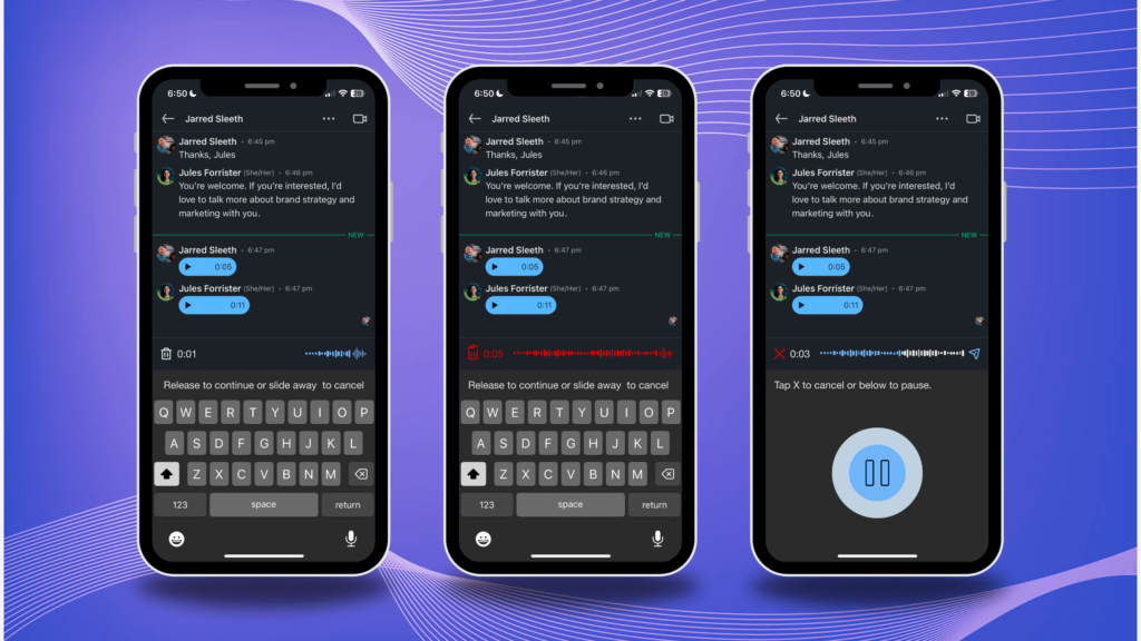
- Add auditory cues that augment visual and vibrational haptic UI.
📝 Give people multiple ways to edit or correct their message, including:
- Option to cancel or start over.
- Possibility to replay voice messages before sending.
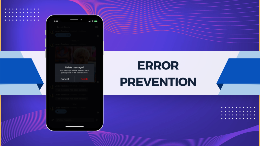
- Option to delete a sent message.
- The receiver’s ability to see a message has been unsent.
Design Process
Double Diamond & UX Honeycomb Frameworks
Data-driven decision-making manifested as a result of using research to refine user problem identification and inform design prototypes. Testing ensured the solution supported the user experience.
This project was also influenced by UX Honeycomb design framework that emphasizes usefulness through usability, desirability, findable layout, accessibility, credibility, and value.
UX Research
Research Objectives
It was important to understand how the LinkedIn voice message feature could be optimized.
- How can responsive design aid the accessibility of voice messaging?
- How can resources, error prevention methods, and features that users enjoy uplift desirability?
- How can LinkedIn subscribers successfully communicate to implement effective systems for long-term usability and retention?
Competitive Analysis
When comparing messaging systems, the primary considerations were to assess the pros or cons of UI patterns and error prevention.
⚙️ UI Patterns
- In what ways do icons differentiate voice messaging features and guide the voice recording user flow?
- How do color palettes and changes communicate function?
- Can opaque overlays give prominence to CTAs and pop-up boxes in general?
- How do text instructions clarify and guide visual users?
- Can haptic UI and responsive design support usability, particularly vibrational and auditory feedback for visually impaired users?
🚩 Error Prevention
- Front-end features such as responsive design, voice recording playback, re-recording, and pop-up boxes confirming users want to send recordings
- Back-end features such as the deletion of sent messages
- Constraints such as maximum recording time and warnings when users approach that 1-minute mark
Interviews
Keeping research objectives in mind, questions about LinkedIn and voice messaging were crafted, submitted to peer review, and reiterated. Ultimately, the aim was to reveal user patterns, preferences, and pain points. 💡
- Recruiting five participants who use voice message features on LinkedIn and other platforms provided qualitative data from a variety of industries and experience levels.
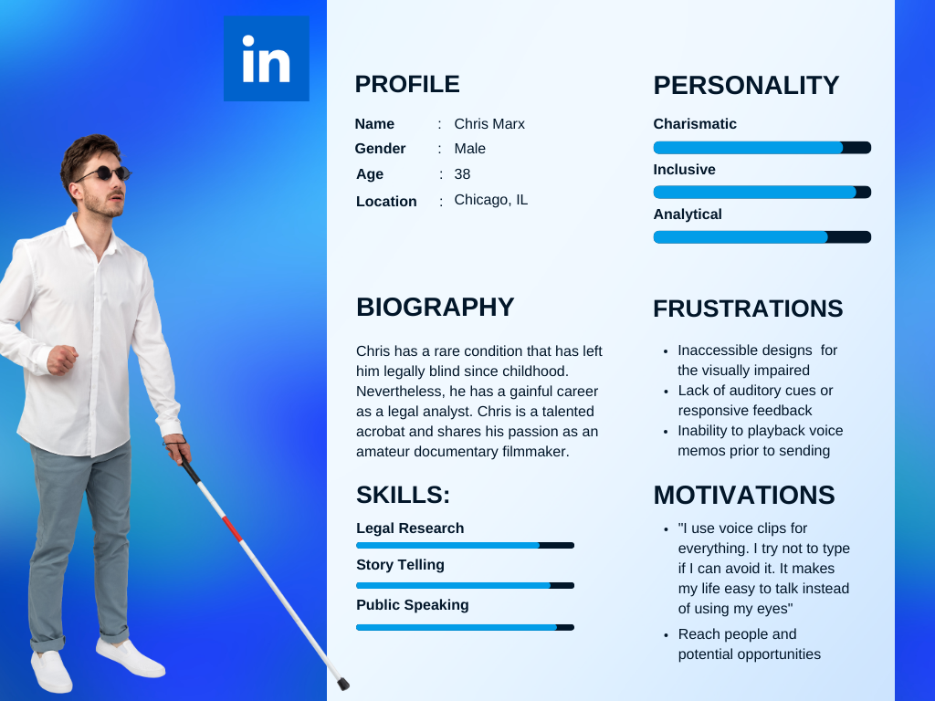
- The incredibly valuable insight about non-visual accessibility came from a legally blind gentleman.
- Info was cross-hatched for affinity maps or personas.
Insightful User Research Quote
Kathryn H. (LinkedIn Subscriber)
“LinkedIn is the number one place I’d want to be able to replay a recorded voice message before sending it.”
Chris J. (Premium LinkedIn Subscriber with +500 Connections)
“I’m legally blind so I use voice messaging for everything all the time. I want it to beep at me when I first hit the button to indicate to me that I am recording.”
“Voice memo playback is preferable but not critical because I like talking. I’m very chatty and I feel like I usually nail it but everybody makes mistakes so I would love the ability to re-record. I usually listen to it before sending it when that’s an option.”
Minh V. (LinkedIn Subscriber with +500 Connections)
“I want to use voice messaging to stand out and add a personal touch when I reach out to prospective connections who receive a lot of messages. When the professional stakes are high, I need to be able to check myself because I can’t risk a bad impression. Being able to edit myself with playback is very important, but LinkedIn doesn’t have that.”
Elena F. (LinkedIn Subscriber)
“Voice memo is a completely useless element of the design if you can’t play it back before sending it.”
UX Research Takeaways


UI Accessibility
- Interactive design is mostly visually oriented on an adaptive feature for the visually impaired
- More haptic UI such as auditory cues can support those who are most likely to use this feature.
Humanize Connection
- People prefer in-person networking to the online experience.
- Voices humanize machine-supported communication via tonality and expression.
Playback
- Users benefit from the ability to playback their voice messages before sending
- Playback can be added without additional steps in the task flow
UX Ideation
Personas
👤 Considering how personas could profoundly help to humanize UX problems for stakeholders, these two were formed. 👤
- Visually impaired persona: workplaces are increasing diversity and inclusion so LinkedIn needs to follow suit, especially since the interviewee this persona was based on is a premium subscriber!
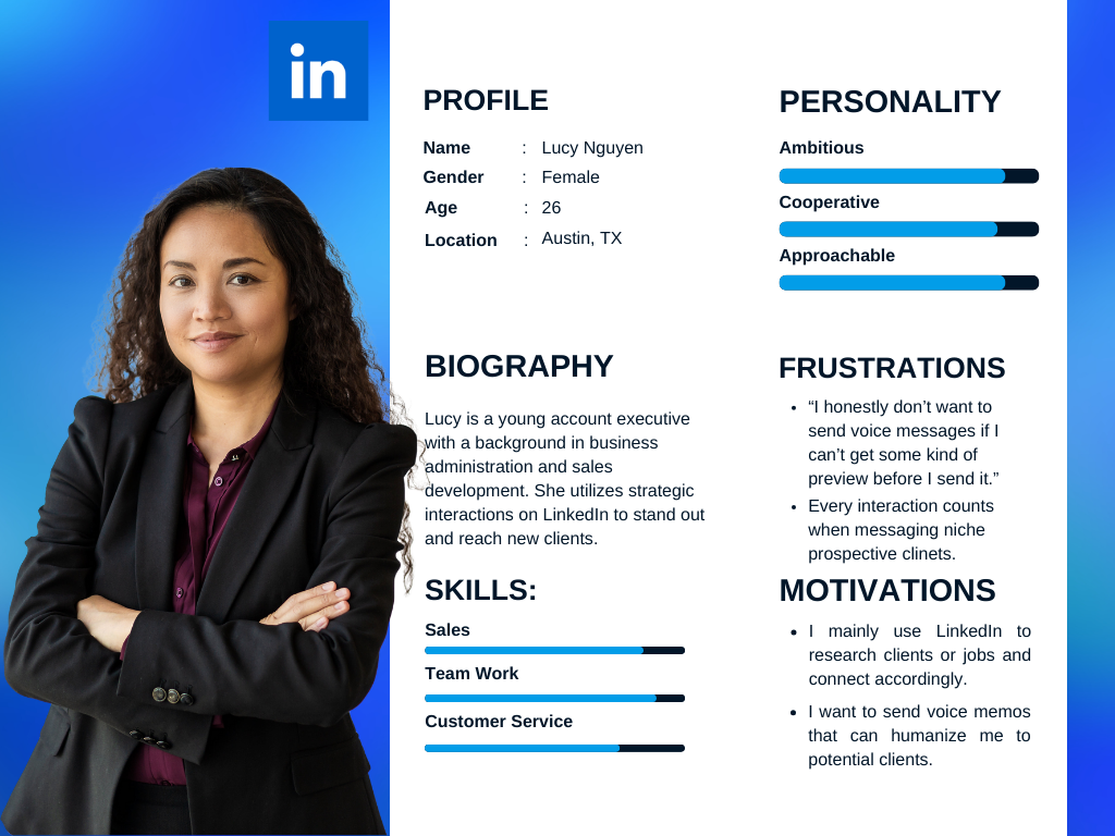
- Intuitive professionals with sales strategy: they understand the importance of humanizing connections to stand out and support connections with most users who prefer in-person networking
Sketches
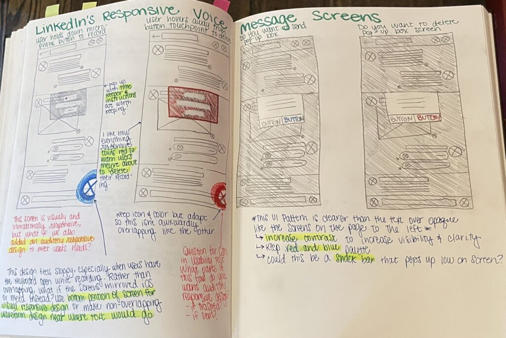
Knowing re-iterations would heavily rely on pre-existing wireframes, the design process began with sketching a lo-fi voice recording user flow with optimization for desirability, accessibility, and overall usability. ✍🏽
- Documenting potential solutions or changes to UI
- Leaving plenty of space for note-taking.
- Sharing with peers to gather insights
- Determining the most popular concepts to translate into hi-fi wireframes
A/B Testing
Next, exploring the most intuitive access point helped to ensure the best option for a button was selected. The voice recording feature had to make sense to users. 🅰️🅱️
- Drawing from community resources in Figma, a handful of waveform icons were collected.
- Resoundingly, participants preferred icon A to icon B, and thus it moved on to the next steps.
- However, per user feedback, the size was slightly scaled down to better mirror the paperclip.
UX Design
Hi-Fi Wireframes
Using Figma, hi-fi wireframes were created to prototype the user flows for LinkedIn voice message feature recording.
- Using screenshots as a foundation to superimpose edits upon allowed for easy reference to the color palette, body copy, etc.
- Originally lacking the option to tap (and not have to hold the button) to record was a shortcoming that inspired two slightly different flows to provide alternative pathways for different interactive designs.
UI Design
Comparing UI elements in dark mode during competitive analysis paved the way to continue that trend in the design process using the iOS Style Guide. The goal of re-iteration was to…
- Understand the ideal haptic responsive design through follow-up questions for the blind interview participant.
- Establish a unified UI pattern that the current design lacks.
- Resolving inconsistent icon usage, such as solid and outlined icons helped ease disruption to visual continuity.
- Retaining initial design elements such as the color palette and responsive rippling circles can allow users to easily adapt to changes.
- Adding snackbars and text overlays assists the user flow.
Usability Testing
📱 Recruiting 7 usability testers who use LinkedIn and voice messaging aligned with research goals. Testing mobile responsive design with Figma on the desktop was challenging because of prototype interactions designed for finger touch points on mobile. Despite these challenges, usability testers navigating the user flow of recording, playing back, and sending a voice message had a 100% success rate. Key takeaways include…
- Value of adding the option to not have to hold the button to record
- tap-only user flow was easier for the majority of testers
- one participant said that he could see how tap-only might prevent user errors
- The need for refined and simplified snack bar instructions.
- early usability testers found some instructions either “confusing,” “distracting,” or “unnecessary”
- re-iterating for later testing clarified the copy within the user flow
Conclusion
Meaningful Metrics
5
People Interviewed
7
Usability Testers
3
Iterations
Next Steps
In conclusion, this design only addresses iOS dark-mode style guides. Due to constraints on time and resources, there is still room for growth on Android OS and in standard light mode.

Dark Mode v. Light Mode
- Incorporating the same features for users who prefer light mode UI is the next logical step.
- Translating the user flow to comparable UI patterns would maintain options for settings and user preferences.

Support for Multiple OS
- User feedback from Apple users led to the conclusion that the design was intuitive for iOS-trained UI patterns.
- Android uses a slightly different material design and it’d be worth evaluating its ease of use.

Further Usability Testing
- Taking the design into in-app beta testing would allow users to intuitively interact on their smartphones with the voice messaging systems.
- This can provide more qualitative data.
LinkedIn Voice Message Feature Learnings
While many competitors leaned into visually responsive design, seeing the benefits of auditory cues changed my approach to problem-solving for the visually impaired. Inspiring growth in my capacity to imagine the potential for haptic responsive design, this project made me think outside the box.
A special thanks to my blind associate, Chris Jeckel, who is a pivotal leader in my work with the Acro Documentary Project: Touching the Sky.
Thanks for Reading my Case Study!
Emphatically, I’d love to hear from you! Think we’d be a good fit for collaboration? Drop me a line at [email protected].
