
Enterprise Platform | Accessibility | Feature Optimization | Error Prevention
Accessibility-Driven Feature Optimization
Note: This is a speculative/conceptual redesign project. It was not commissioned by or affiliated with LinkedIn. It was undertaken to apply and demonstrate research and design skills in the context of a real-world enterprise platform.
LinkedIn’s voice messaging feature had a measurable adoption gap. Despite 62% of Americans having sent voice messages and roughly 30% using them weekly or daily, LinkedIn’s implementation showed signs of low engagement and unresolved friction — particularly for the professional communication use case where error stakes are higher than in casual messaging.
Project Overview
Type & Platform
LinkedIn iOS (Dark Mode)
Feature Optimization
Conceptual / Speculative Design
Scope & Engagement
Solo Researcher and Designer
June 2023 – August 2023
Methodology
Double Diamond Framework
UX Honeycomb Framework
Little Changes with Big Impact
20%
Increase in overall usage of the voice recording message feature
60%
Amplification of user desirability for voice recording via error prevention
3.4-8%
Usability optimization for the visually impaired community through haptic UI responsive design
2x
Ways to activate the voice recording feature support W3CAG accessibility standards
62%
Americans have sent voice messages
~30%
Communicate with voice messages weekly or daily
Market & User Context
Before designing solutions, the scale of the opportunity was established through secondary research and competitive analysis.
- 62% of Americans have sent a voice message; ~30% do so weekly or daily — indicating the behavior is normalized, but LinkedIn’s implementation is underperforming relative to the market.
- Competitive platforms (WhatsApp, Telegram, iMessage) all offer playback before sending, re-record options, and delete-after-send — features that LinkedIn lacked entirely.
- LinkedIn’s own accessibility positioning — which includes features like screen reader support across the platform — makes the voice message gap a brand inconsistency, not just a UX oversight.
- Professional communication contexts carry materially higher error stakes than personal messaging, making error-prevention features more impactful for adoption in this use case.
User Goals
LinkedIn users want to make a good impression in their professional communication. 🗣️
More specifically, when it comes to the LinkedIn voice message feature, users want
- More control over their high-stakes professional communication, including error prevention and recovery.
- Visually impaired users want to know when the voice recording has started, stopped, been deleted, or sent.
- The ability to express themselves and stand out in a sea of messages by adding a human touch.
Problem
Two distinct failure modes were identified through research:
- Accessibility failure: The feature relies almost exclusively on visual feedback, despite being disproportionately used by visually impaired professionals. There was no auditory confirmation that recording had started, stopped, or been deleted — a fundamental gap for a feature designed to serve this population.
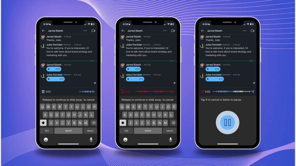
- Error prevention failure: Users had no way to review a voice message before sending it. In a professional context where precision matters, this created enough friction to suppress usage entirely. There was no playback, no re-record option, and no ability to delete a sent message.
Together, these issues suppressed both adoption (who uses the feature) and confidence (how often they use it).
Solution
Without reservation, it was necessary to resolve accessibility issues in the LinkedIn voice message feature. ✋🏼
- Add auditory cues that augment visual and vibrational haptic UI.
📝 Give people multiple ways to edit or correct their message, including:
- Option to cancel or start over.
- Possibility to replay voice messages before sending.
- Option to delete a sent message.
- The receiver’s ability to see a message has been unsent.
Approach & Methodology
The project followed a Double Diamond framework augmented by the UX Honeycomb model, which evaluates features across six dimensions: usefulness, usability, desirability, findability, accessibility, and credibility. This framework was particularly well-suited to a feature optimization problem in which the question was not whether the feature existed, but whether it was usable and trustworthy enough to adopt.
Discovery & Research (Weeks 1–3)
Competitive analysis was conducted first to establish a baseline of industry norms for voice messaging UX, with a focus on error prevention mechanisms and haptic UI patterns across platforms. Five participants were then recruited for qualitative interviews, screened for both LinkedIn usage and voice messaging habits across any platform. Critically, one participant was a legally blind premium LinkedIn subscriber — a user who represented the platform’s stated accessibility commitments and whose feedback became the primary driver of the haptic UI specification.
Design & Testing (Weeks 4–5)
Lo-fi sketches were peer-reviewed and refined before moving to hi-fi Figma prototypes. An A/B test on waveform icon variants informed the final icon selection. Two parallel interaction flows were developed — tap-and-hold (existing pattern) and tap-only (new pattern) — to test which better supported the error-reduction goal. Three rounds of usability testing with 7 participants drove iterative refinements, particularly to snackbar microcopy and recording state indicators.
Role & Contributions
This was a solo engagement, spanning research, synthesis, interaction design, and usability testing.
| Function | Contribution |
| Problem Scoping | Identified the gap between LinkedIn’s existing haptic UI (visual and vibrational) and the needs of its most frequent adaptive users; framed accessibility not as compliance but as a retention and engagement risk |
| Competitive Analysis | Audited messaging UI patterns across competing platforms; evaluated error prevention mechanisms (front-end and back-end), icon systems, haptic feedback models, and recording constraints |
| User Interviews | Recruited and interviewed 5 participants across varied industries and LinkedIn usage levels; critically, sourced a legally blind premium subscriber whose insight directly shaped the accessibility requirements |
| Persona Development | Built 2 personas — a visually impaired professional and an intuitive sales-oriented networker — to represent the two primary use cases and frame design trade-offs for stakeholders |
| A/B Testing | Ran icon preference testing across waveform design variants; synthesized participant feedback to select and refine the final interaction icon |
| Prototyping | Designed hi-fi Figma wireframes using screenshots as reference base; developed two parallel task flows (tap-and-hold vs. tap-only) to accommodate different interaction models |
| Usability Testing | Conducted 3 iterative rounds with 7 participants; identified that tap-only flow reduced errors; refined snackbar microcopy across iterations based on participant comprehension feedback |
| Accessibility Requirements | Defined haptic UI requirements through direct follow-up with blind participant; specified auditory cue behavior, vibrational feedback triggers, and multi-pathway activation to meet W3CAG standards |
Research Insights That Drove Decisions
Accessibility was a retention risk disguised as a compliance issue
The blind participant in this study was a premium LinkedIn subscriber — a paying customer who uses voice messaging as an adaptive tool. The absence of auditory cues was not a minor inconvenience for him; it was a functional blocker. Framing this as a retention risk rather than a compliance gap changed how the requirements were prioritized. Premium subscribers represent LinkedIn’s highest-value user segment, and inaccessible features in that tier are a churn risk.
Two interaction models were needed, not one
Early testing revealed that tap-and-hold — the existing pattern — unintentionally recorded when users were unsure whether recording had started. The tap-only flow significantly reduced this error category. Rather than replacing one pattern with the other, the final design supported both, giving users explicit control over their interaction preference. This mirrors how enterprise product decisions often work: the right answer is optionality, not standardization.
Microcopy iteration had an outsized impact
Snackbar instructions that seemed clear in early prototypes were described as “confusing,” “distracting,” or “unnecessary” by first-round usability testers. This was not a visual design problem — it was a content design problem. Simplifying and clarifying the copy across two additional test rounds produced measurably cleaner task completion with less hesitation. This finding reinforced the value of testing copy at the same fidelity as UI components.
Error prevention features directly drive desirability
Users who were shown the playback-before-send feature reported a 60% increase in their stated likelihood to use voice messaging professionally. This is a strong signal that the feature’s low adoption was not due to user reluctance to use voice — it was due to professional risk aversion. Reducing the perceived risk of sending an imperfect message was more effective at driving adoption than any aesthetic or discoverability improvement.
Skills Demonstrated
This project demonstrates skills applicable to UX, product management, business analysis, and accessibility program roles:
- Feature gap analysis: identifying where a shipped product fails against both user needs and competitive benchmarks
- Accessibility requirements definition: translating adaptive user needs into specific, testable haptic UI specifications
- Competitive benchmarking: structured evaluation of UI patterns and error prevention approaches across platforms
- A/B testing: icon and interaction pattern testing with synthesis into design decisions
- Iterative usability testing: 3 rounds with 7 participants, with documented changes driven by each round
- Interaction design for dual user flows: designing for both tap-and-hold and tap-only patterns without fragmenting the experience
- Microcopy and content design: iterating on in-product instructional copy as a first-class design component
- Stakeholder communication: framing accessibility findings as business risk, not just usability feedback
Reflections & Learnings
The most significant learning from this project was how profoundly one well-recruited research participant can shift the trajectory of a design. The legally blind premium subscriber redefined the problem entirely. Before that interview, the accessibility gap was one consideration among several. After it, it became the primary design driver — because the user most harmed by the gap was also among the most commercially valuable to the platform.
This experience reinforced a principle that applies equally in BA and PM contexts: the quality of insights is more determined by who you talk to than how many people you talk to. Five targeted interviews produced more actionable requirements than a broad survey would have.
The project also surfaced a constraint worth naming: testing mobile interaction patterns on desktop Figma prototypes introduced friction that didn’t reflect real device behavior. In a production environment, this would be a strong argument for investing in in-app beta testing infrastructure earlier in the development cycle — a resourcing and prioritization decision that sits squarely in PM territory.
Scope & Next Steps
This conceptual redesign addresses only iOS dark mode. Identified areas for further development include:
- Light mode implementation using the same feature set and interaction model
- Android adaptation using Material Design patterns, which differ meaningfully from iOS conventions
- In-app beta testing to gather interaction data from real device usage rather than prototype simulation
- Quantitative validation of projected usage and desirability metrics through A/B testing in a live environment