
Cross-collaborative agile UX/UI Research and Design
UX Research for Redesign
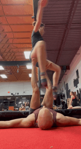
Whether teaching acroyoga or conducting market and user research for Laché Movement Collective, I make impressive moves! Cue a more accessible and responsive web redesign that better caters to a disproportionately neurodiverse target audience. Ultimately, my qualitative data collection contributed to increased revenue resulting from resolving usability issues and refining the digital product to align business goals with user needs.
Overview
My Role
- UX Researcher
- UX/UI Designer
- UX Copy Writer
- Brand Strategist
Team
- Head of Finance: Alissa Winzeler Cotton
- Studio Manager: Brittney Montalvo
- Initial Web Designer / SEO Professional: Dmitri Gonzalez
- Marketing Manager: Cali Thompson
- Stake Holders: Brent Cotton, Sonnie Boyson
Timeline
- March 2023 – May 2023
- Total Time: ~120 Hours
- Overall: 6 Weeks
- Discovery & Research: 3 Weeks
- Design & Testing: 3 Weeks
Impactful Changes for Local Business
16%
Total revenue increase since launching the redesigned mobile-first website
8%
Boost in product awareness from adherence to W3CAG visual accessibility standards
≥15-20%
Increase in usability for neurodivergent clients via cognitively accessible UX such as information architecture
100%
Success rate of usability testers navigating the user flow for private events
5
Distinct user flows embedded within a unified customer journey
13
Usability issues discovered via heuristic evaluation and resolved in redesign
Business Goals
These are the business trends and goals articulated by the head of finance that were closely considered.
- Classes drive the most revenue (drop-ins, class packages, and memberships) and should thus be the primary CTA.
- Private parties, events, and workshops can increase revenue streams that help push profits “over the top,” so they require clear user flows.
- Visual content should promote aerials and poles because these are the “strongest money makers,” but showcase all offerings.
- There’s a demand for youth programs, but it’s challenging to find qualified individuals to teach children.
User Goals
There are a handful of different users because there are so many ways to play. Here are some of their desires and motivations:
- Most users are looking for fitness classes that are more playful and nurturing to their inner child than traditional cardio or weightlifting.
- Often, users are training to feel sore “in the best of ways.”
- Many admire cool tricks and want to build skills.
- Community and relationship building are motivators that typically prompt students’ growth with a coach.
- Performance opportunities, such as showcases, motivate some users.
- Some want to rent space for private lessons, parties, or public workshops.
Problem
Laché is delightfully extra.
- The paradox of choice contributes to customer conversion drop-off points, but the variety of movement disciplines prevents burnout and sets Laché apart.
- Having multiple ways to participate in various services requires better differentiation of user flows.
These issues came up in an audit through a mini heuristic evaluation.
- Poor error prevention and recovery
- Inaccessible UI design
- Inconsistent CTA buttons
- Disorganized IA and broken links

Solution
Resolving existing usability issues flagged in the mini heuristic evaluation was key to this responsive web redesign project.
Deliver personas and user flows to the marketing manager.
- Help users envision the fun fitness experiences that await them throughout each step of the user flow so that they can close the sale.
- Narrowing down the niche of the user to serve each task flow with content that provides continuity for the target audience.
- Customer conversion and engagement are more easily accessible when info can be shared by staff and the community.
Responsive Web Redesign Process
Double Diamond Framework
I gather research through discovery and exploration to identify and define user problems. Then, I develop prototypes that undergo further testing to ensure the solution supports the user experience. The cross-team collaboration of the agile UX workflow also influenced design thinking. Check out the website!
UX Research
Firsthand UX Difficulties
Before beginning this project, I failed to register for an acroyoga dance lift workshop due to a lack of password recovery. Seeing a customer drop-off point prevent a sale, I brought it to the attention of an acroyoga partner who co-owns Laché. He helped me sign up, and I offered to address usability issues with a responsive web redesign —a win-win!
If not for my relationships within the community, Laché might have key hits to their bottom line, and I’d have missed my chance to fly with the world-famous Acro James. In a heuristic audit, I identified:
- Usability issues like error prevention and recovery
- UI inaccessibility
- Mobile responsive shortcomings
- Slow load times are affecting SEO
Research Objectives
Drawing on personal experience gave me preconceived notions, so it was imperative to step into the shoes of other users.
- Explore user needs, desires, and struggles.
- Pinpoint what sets Laché apart from other fitness facilities.
- Analyze insights to highlight the unique brand of magic at Laché!
- Tell an inviting story that reflects the culture and community
- Inspire people to come play
Heuristic Evaluation for Responsive Web Re-Design
Due to time constraints, a mini heuristic evaluation was conducted using Nielsen’s method.
- Error prevention and recovery with WL is primarily outside of LMC’s direct control; however, resolving issues by sharing feedback with the SaaS company is an avenue of exploration.
- IA issues include broken links, links to incorrect pages, and discrepancies between the menus at the top and bottom.
- Images lack mobile-friendly scalability and accessible color contrast text overlays. They’re undesirably described as “antique.”
- Multiple CTA button styles from page to page challenge user pattern recognition.
- Slow load times, especially on mobile devices, are problematic due to the presence of many large images and excessive animation.
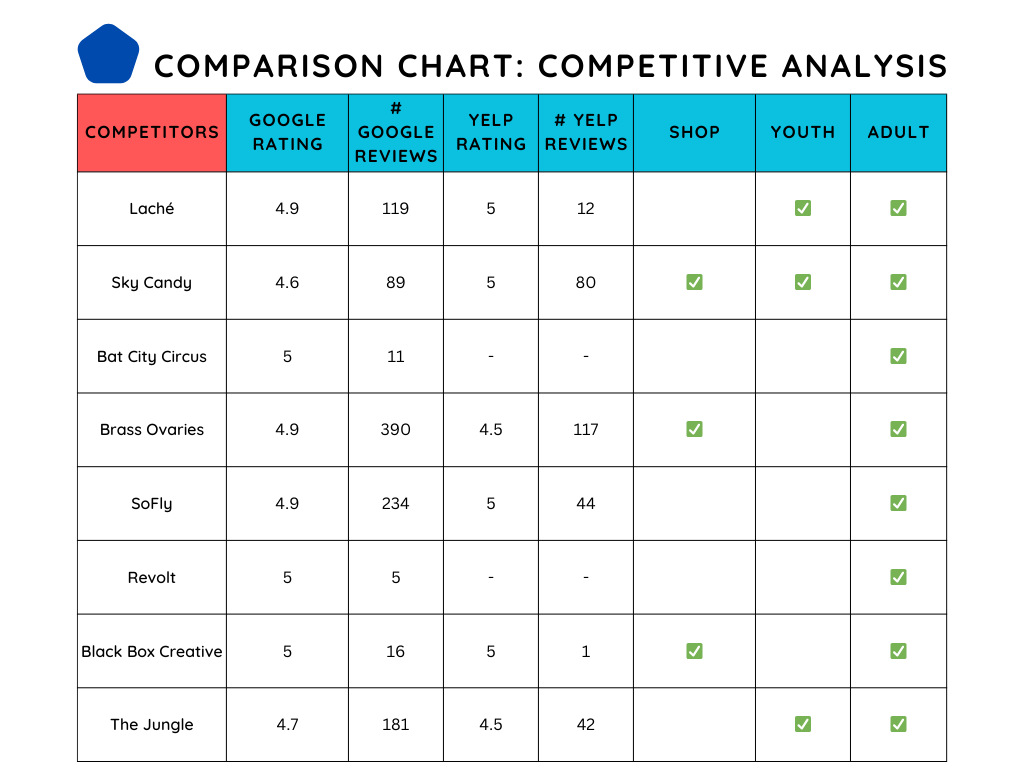
Competitive Analysis
Discovering other businesses’ solutions to staff pain points and the needs of a shared target audience was helpful.
- Users consistently rank Laché better for cleanliness. A polished UI can effectively incorporate this brand value into the digital presence.
- Competitor sites load faster, which helps with SEO.
- Many use less animation to pack a more powerful visual punch with dark, edgy UI.
- Google searches for bachelorette parties are stronger for BO, IDS, SF, and BBC.
- Private-party pages often purchase additional domain names to improve their ranking while having a shorter and thus more shareable link.
Market Research
Overall, LMC’s magic lies in its ability to offer everything under one roof. The marketing manager corroborated my analysis and mentioned that “finding our niche is one of the bigger-picture challenges we’re digging into through this process.”
- Metrics on Google and Yelp reviews appear to be positive.
- Laché serves a more diverse demographic.
- An integrated digital shop could be a point of growth to help further increase revenue.
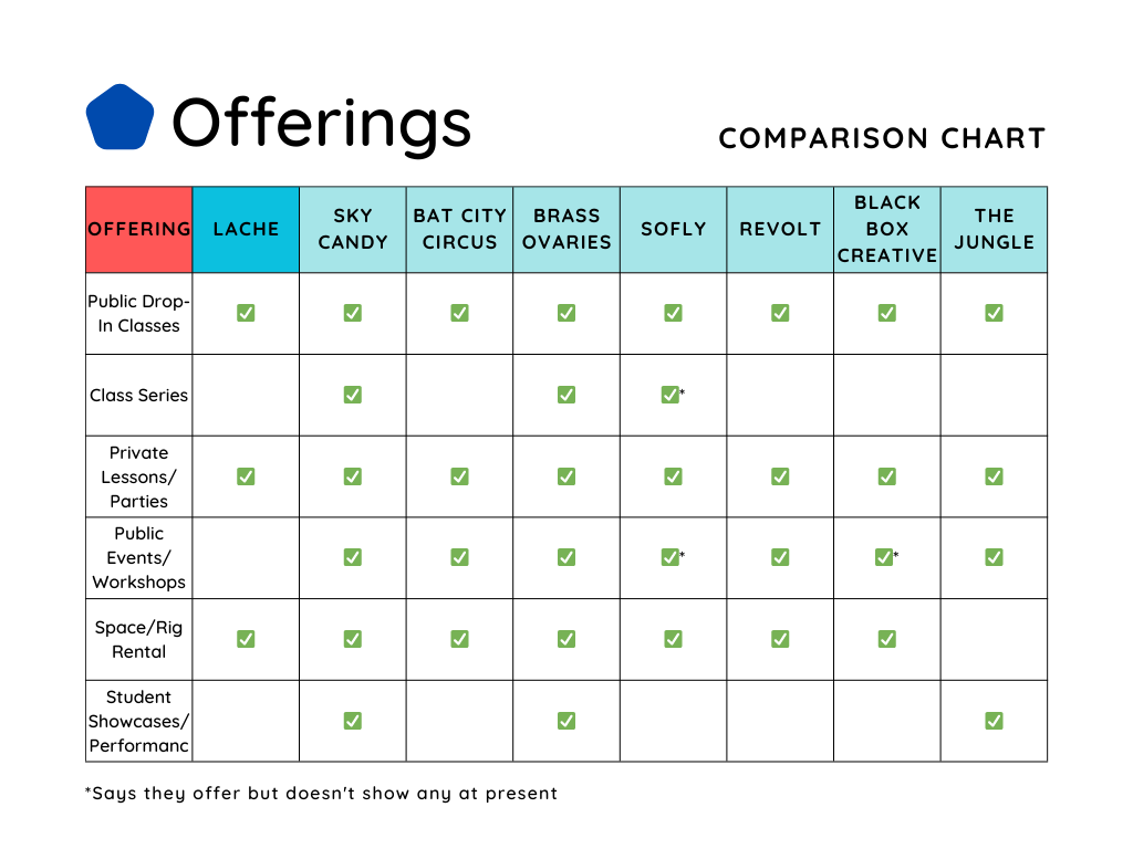
- While I later learned that LMC does host student showcases, performances, public events, workshops, and class series, it was unclear based on the web content.
Interviews, Focus Groups, & Contextual Research
On Wednesday nights, Laché users gather for extended hours at “Superhuman Study Group.” This is an ideal time for conducting UX research via focus groups; however, some insights were gathered through contextual research, including visiting the facility for drop-in classes and scheduling one-on-one interviews.
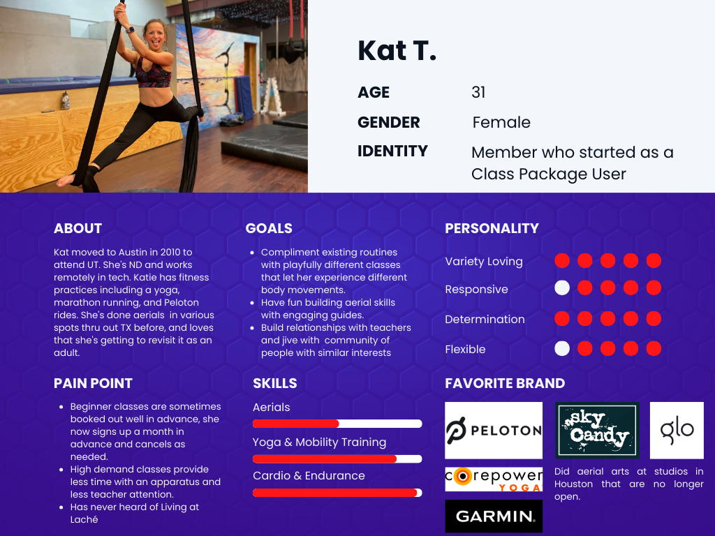
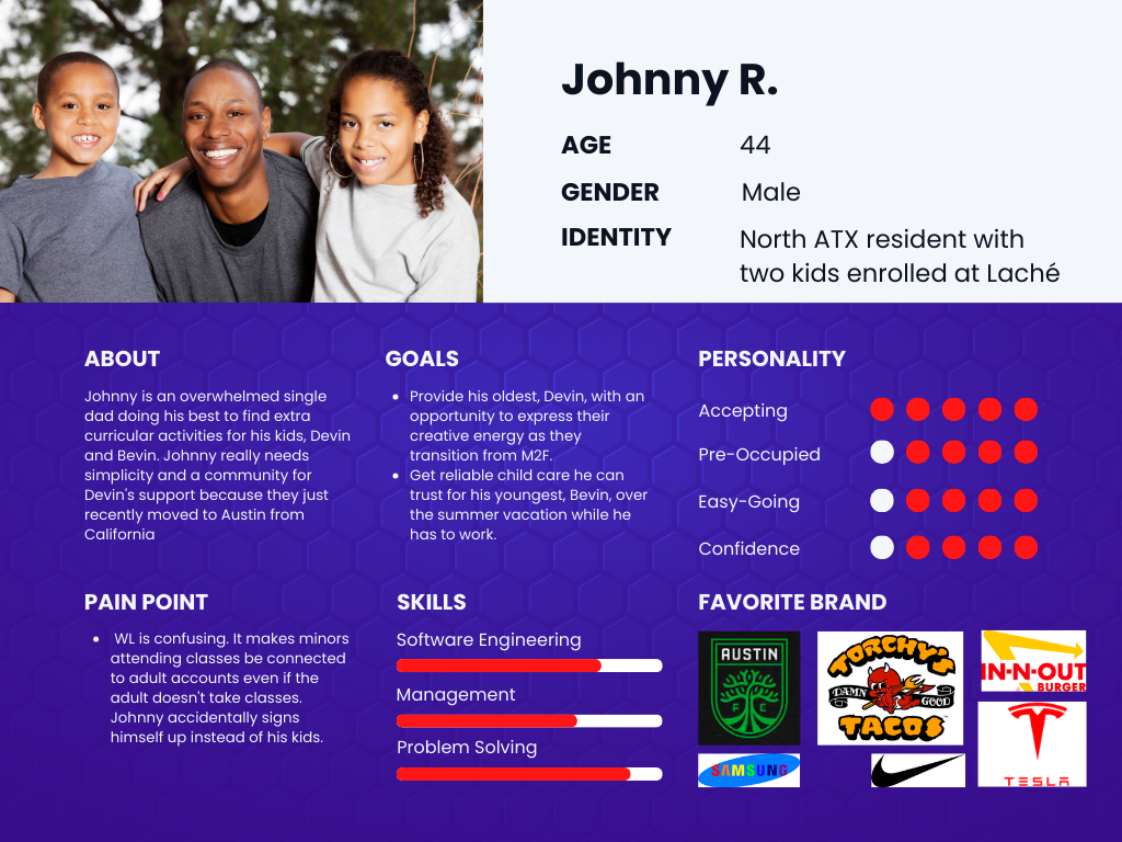
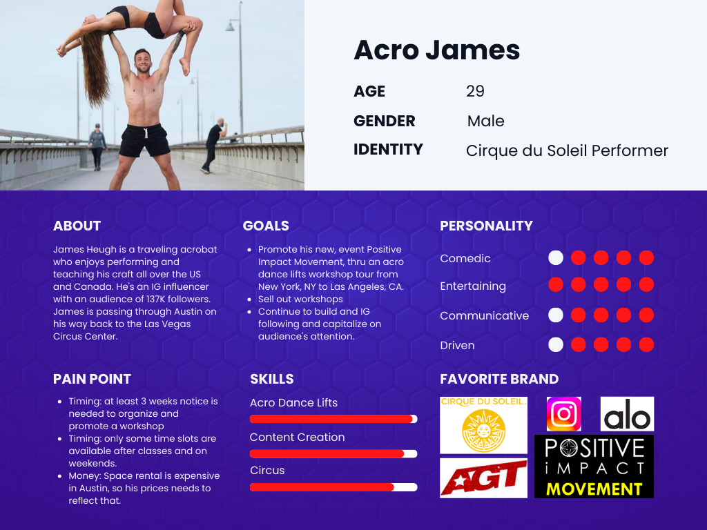
- Developing peer-reviewed questions provided a structure for inquiry with 18 users, ranging from members, class package users, ClassPass users, staff, and co-owners, through interviews and focus groups.
- Allowing flexibility to pivot from 1:1 to group sessions, depending on participant availability, optimized time management while benefiting from collective intelligence.
- Further questioning for well-integrated community members with an understanding of the culture and lesser-known offerings is illuminating.
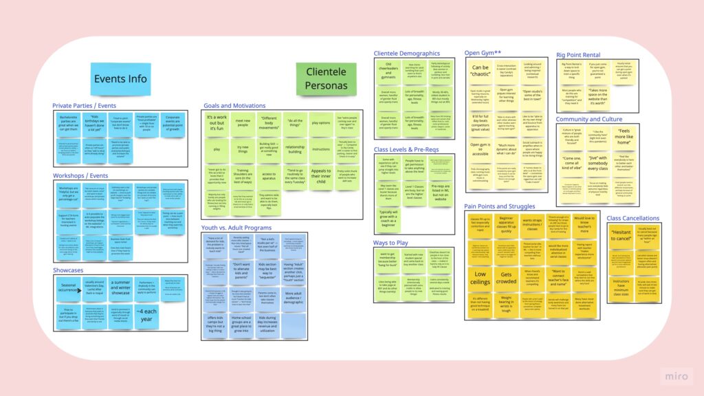
UX Research Takeaways

Life is Spicy at Laché
- Laché is for the variety lover, and that’s part of the challenge in establishing their digital presence.
- People explore different classes and memberships. This intentional setup “prevents burnout.”

Consider Personas
- Establishing personas for private events and space rental is a point of growth they need help tapping into.
- Sequestering youth in IA while not alienating parents is ideal, as youth services make up only half of the business.
Space Constraints
- Laché is an open space that allows cross-disciplinary curiosity, but it can be limited and “chaotic” during peak times.
- Events that don’t intersect with classes optimize utilization.
- Open gym is a great value that’s not well highlighted.
UX Ideation
Personas
Personas help to contextualize and target users. Thereby, they’re frequently consulted to empathize and challenge assumptions.
- Class attendees: users with memberships, class packages, and ClassPass
- Private event bookers: who likely stumbled upon the website while searching for aerial arts or pole parties, and need info about logistics
- Workshop hosts: skillful teachers looking for a venue to host an event; ideally, they promote themselves, but some may rely on Laché to help advertise
- Parents or legal guardians: research suggests that “parents come in, but don’t often take classes themselves,” so facility access is for their kids
User Flows
User and task flows were envisioned using personas and business goals as the basis for differentiating starting points.
- Most users are new to Laché and looking to take classes. As this is the primary source of revenue, it should be the first CTA in the hero section to sustain business growth.
- Some users are event attendees. Events are profit generators with optimal space utilization, so refining these flows is essential, but secondary to more common user goals.
- Few users are space rental customers. This user often promotes their own offerings, requiring minimal effort from Laché. Still, it would be beneficial for the business to have dedicated pages to support marketing efforts.
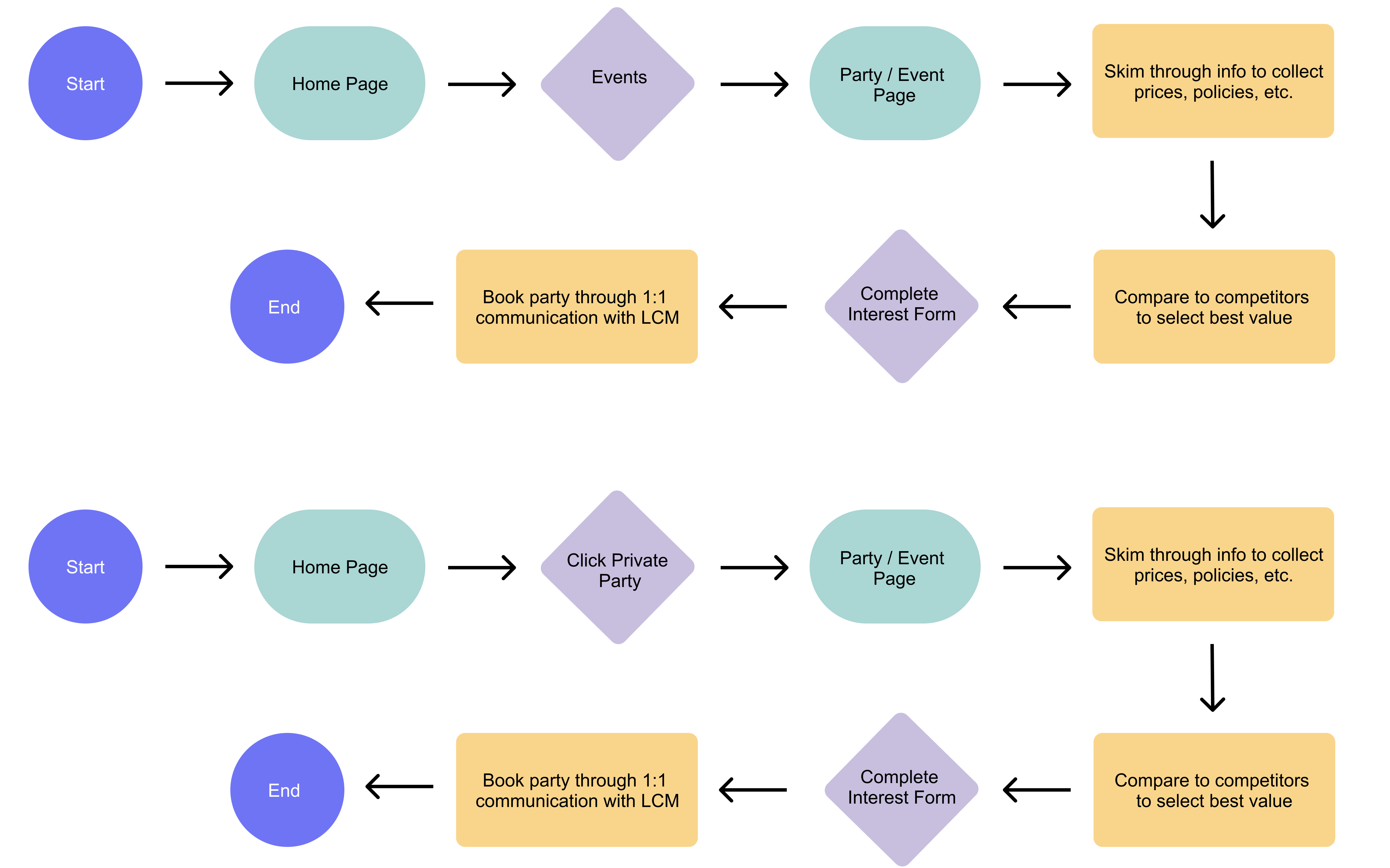
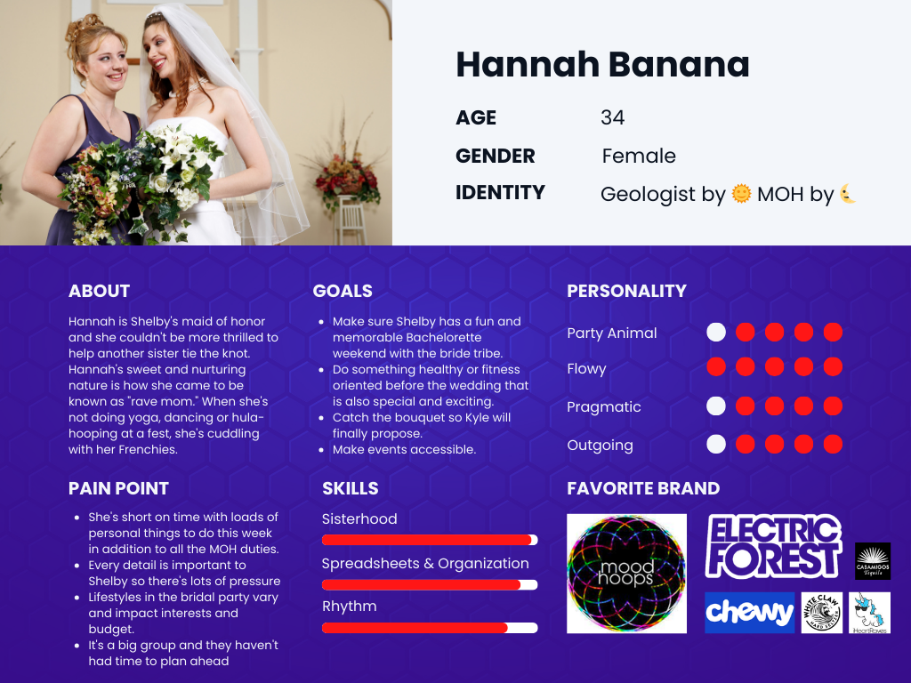
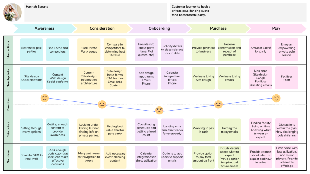
Customer Journey
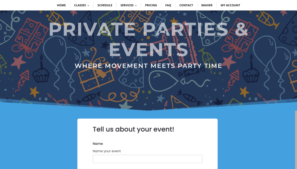
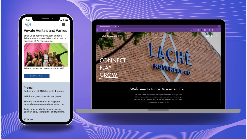
This initial design (depicted above) for private parties jumps to the CTA without providing necessary body copy, such as pricing, policies, and scheduling information. Contrast competitors and customer journey culmination in user flow. The newly proposed customer journey for a busy maid of honor trying to book a private pole party highlights key moments that can significantly impact customer conversion.
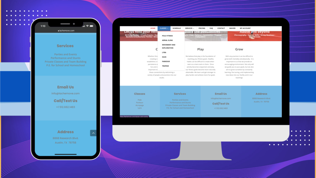
Tree Jack Sorting
The marketing manager shared a newly proposed IA with 8 top menu navigation link parent pages, an improvement on the existing IA that had 9. As a UX Designer, I suggested further simplification of the 6 links, which were remotely tested for usability through remote tree jack sorting sessions on Optimal Workshop.
- Consolidating the “FAQ” and “Waiver” pages as child pages under “About” provided a clear position for the “Meet the Team” page, which, although not included in the proposal, was supported by user desirability discovered in research.
- Shifting child pages under “Services” to “Events” and adding child pages for “Workshops” and “Showcases” would help highlight offerings. Research shows people are motivated by performance opportunities, but those are only posted on a secret Facebook group called “Living at Laché.”
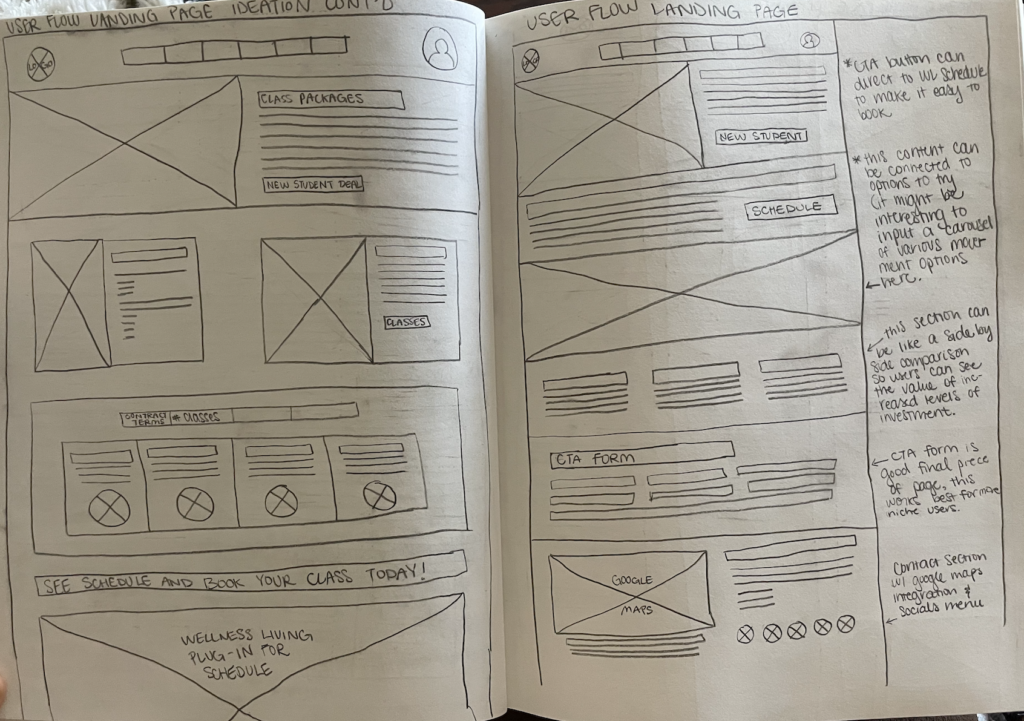
Sketches
Sketches were informed by business goals and ways to improve upon the heuristics evaluation. Starting with the home page to enhance users’ first impressions, sketches were created to facilitate the easy gathering of feedback about possible solutions.
UX Design
Wireframes
Using Figma, mid-fidelity wireframes were created to grow into later hi-fi iterations. After customer journey maps revealed the necessity for more content, this was prioritized.
- Borrowing relevant body copy from competitors as a placeholder was necessary to maintain the project timeline while Laché team members were unavailable.
- Adding images dramatically improved the aesthetic, yet proved rather challenging due to the wide breadth of offerings and styles available in stock images. It was essential to maintain image style continuity.

Usability Testing
Translating lo-fi sketches to a mid-fidelity Figma prototype required improvising with borrowed body copy from competitors to begin testing. The prototype continued to evolve over the course of 2 iterations based on feedback from 9 usability testers. As usability issues were resolved and desirability data were collected, the UI came together.
Operating on the logic that users who could complete a task flow with less visual prominence would likely be able to do so with task flows given a greater visual hierarchy, the private parties and events task flow was tested.
- Usability testing yielded a 100% success rate
- All user flows are designed similarly to aid pattern recognition
- Altered text size, negative space, and visual hierarchy based on usability testing insights.
UI Design
With limited time, I designed exclusively for iPhone and drew from the iOS Style guide. Laché already had branding, and the marketing manager intended to use a web design template, so UI design wasn’t critical- it just had to model accessibility to resolve usability issues. Leaning into a visual expression of brand values such as inclusion, community, and cleanliness meant…
- Meeting cognitive accessibility standards for the many neurodiverse users who benefit from multiple navigation pathways.
- Clean and light UI style accentuated with pops of playful color.
- Blues instill trust and security, making them the primary color for a facility known for safe rigging.
- Despite the temptation to incorporate bold reds (a dominant color of the facility), user associations with danger and errors could be avoided.
Laché is the name of a move used to swing from bars or branches, a nod to the parkour and aerials foundations.
The unified culture statement is “With love, we rise.”
Their current logo was adapted from one with harder edges, representing the history of Laché via softening a free-runner symbol that converged with the smoothness of aerial arts.
Usability Testing Insights
Access from Multiple Pathways
- Especially since a co-owner acknowledged that Laché tends to attract neurodivergent individuals, cognitive accessibility standards are essential.
- Users who accessed the task flow from the navigation menu did so quickly without struggle. Meanwhile, users who scrolled through the home page tended to take longer and get distracted while reading content for other task flows.

Hamburger Menu Clarity
- Since users who navigated through the site had an easier time, it made sense to make the hamburger menu more prominent, allowing targeted branches for user flows to be accessed with minimal scrolling.
- The touch point was changed from a double line to a triple line icon because feedback uncovered that this style of menu was more easily recognized.
Conclusion
Next Steps
Per the business’s request, I created multiple personas and user flows for this responsive web redesign project. However, due to time constraints, I was only able to examine and test the user flow for booking a private party. Each persona and user flow could be further developed to confirm that they feel intuitive.

Additional User Flows
- Follow a similar pattern to mirror the success found in private event user flow usability testing.
- Evaluate hamburger menu icon adaptations.
Third-Party Feedback
- Share feedback with Wellness Living to seek a resolution for error prevention and recovery problems.
- Report and defer to a Wellness Living specialist.
Marketing to the Target Audience
- Launch email marketing campaigns that direct target audiences to user flows with CTA’s.
Learnings from Responsive Web Re-Design
During this cross-functional team collaboration, I learned a great deal about time management and maintaining workload momentum while waiting for resources and responses from others. This provided me a chance to take the initiative and circle back.
Being a UX Designer for a service that I use required greater awareness of personal bias. It was eye-opening when personal assumptions about LMC’s business model were proven false in research. Because I was inconvenienced by a last-minute class cancellation and had positive experiences with the class series model offered at Sky Candy, I incorrectly assumed…
- Other users saw class cancellations as a bigger pain point than they were.
- Class series provides value for continuity and skills development.
Thanks for reading my case study!
Do you think we’d be a good fit for collaboration? I’d love to hear from you. Drop me a line at [email protected].
Strongman stickers created by Stickers – Flaticon“>Illustrations borrowed from Flaticon